UX design: Information architecture, Wireframe and Prototype UI develop: Direct UI creation on Power BI
External: Product owner, Sponsored users (Relevant representation from DS Smith)
To comply with my non-disclosure agreement, I have omitted and obfuscated confidential information in this case study. The information in this case study is my own and does not necessarily reflect the views of DS Smith plc.
Optimizing operations for competitive advantage
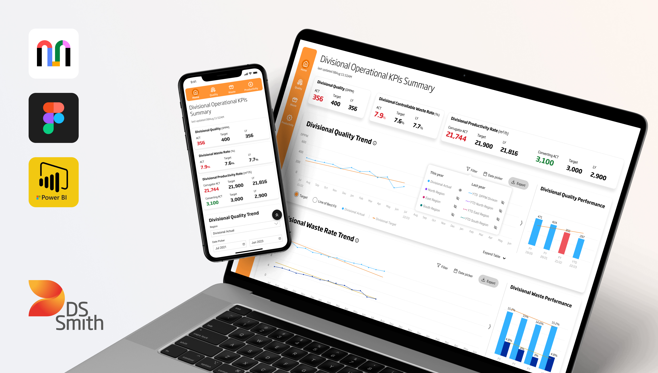
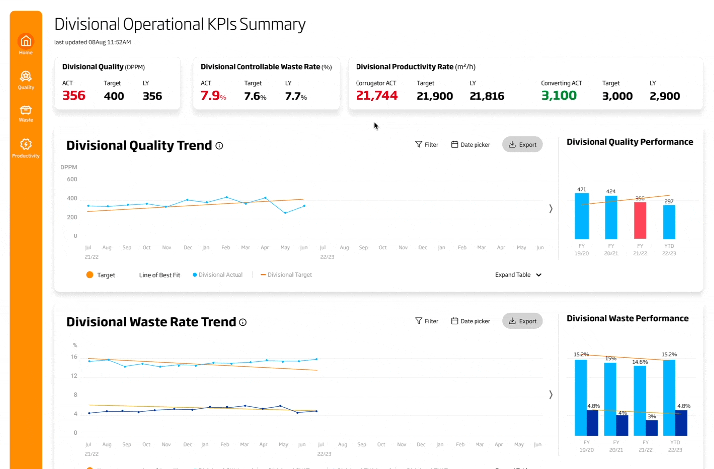
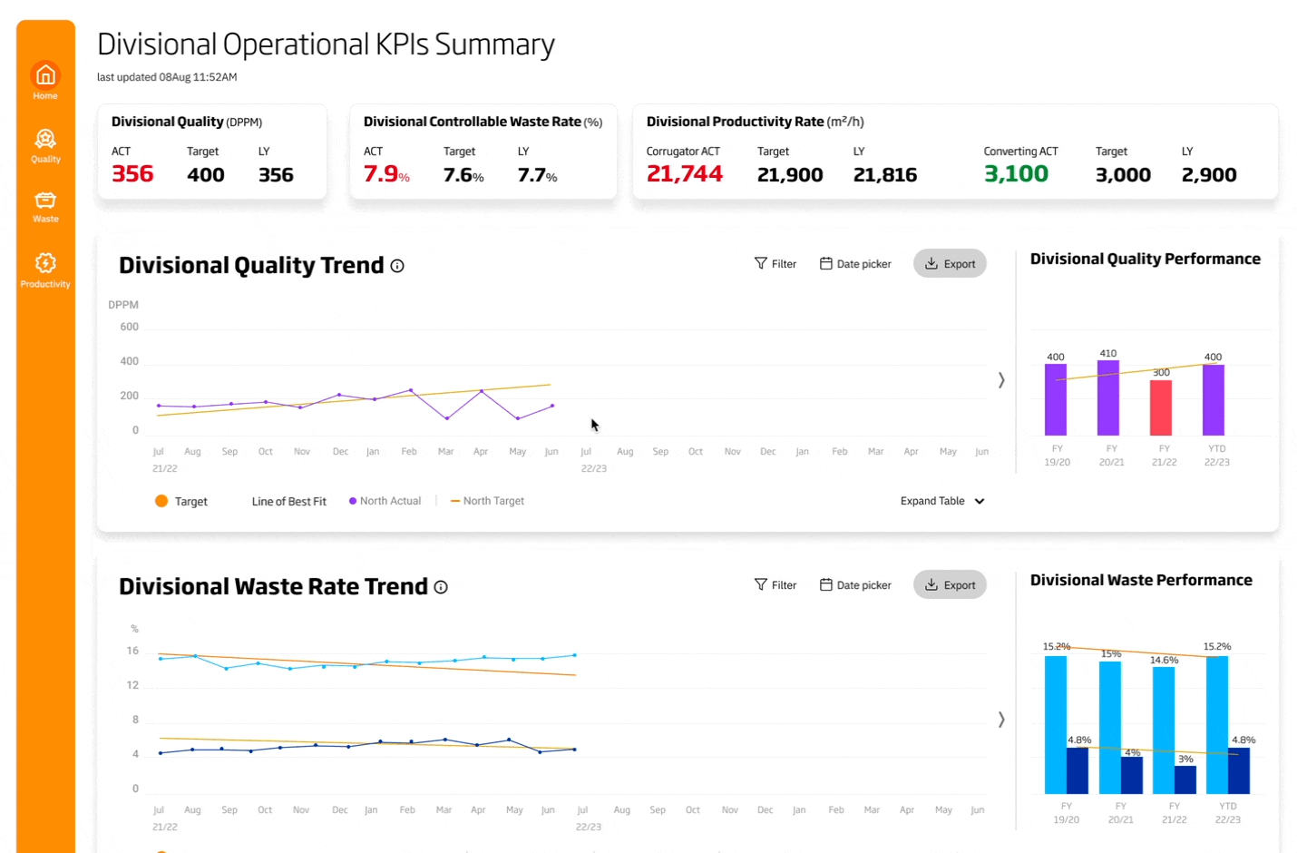
As a leading global packaging company specializing in paper products, DS Smith needed an efficient way to monitor and manage operations across their regions and plants. To meet this need, our team designed a centralized and automated dashboard that displays all real-time regional and plant KPIs. This dashboard empowers operational managers to easily track processes and optimize operations, ultimately improving DS Smith's performance in the competitive global packaging industry.
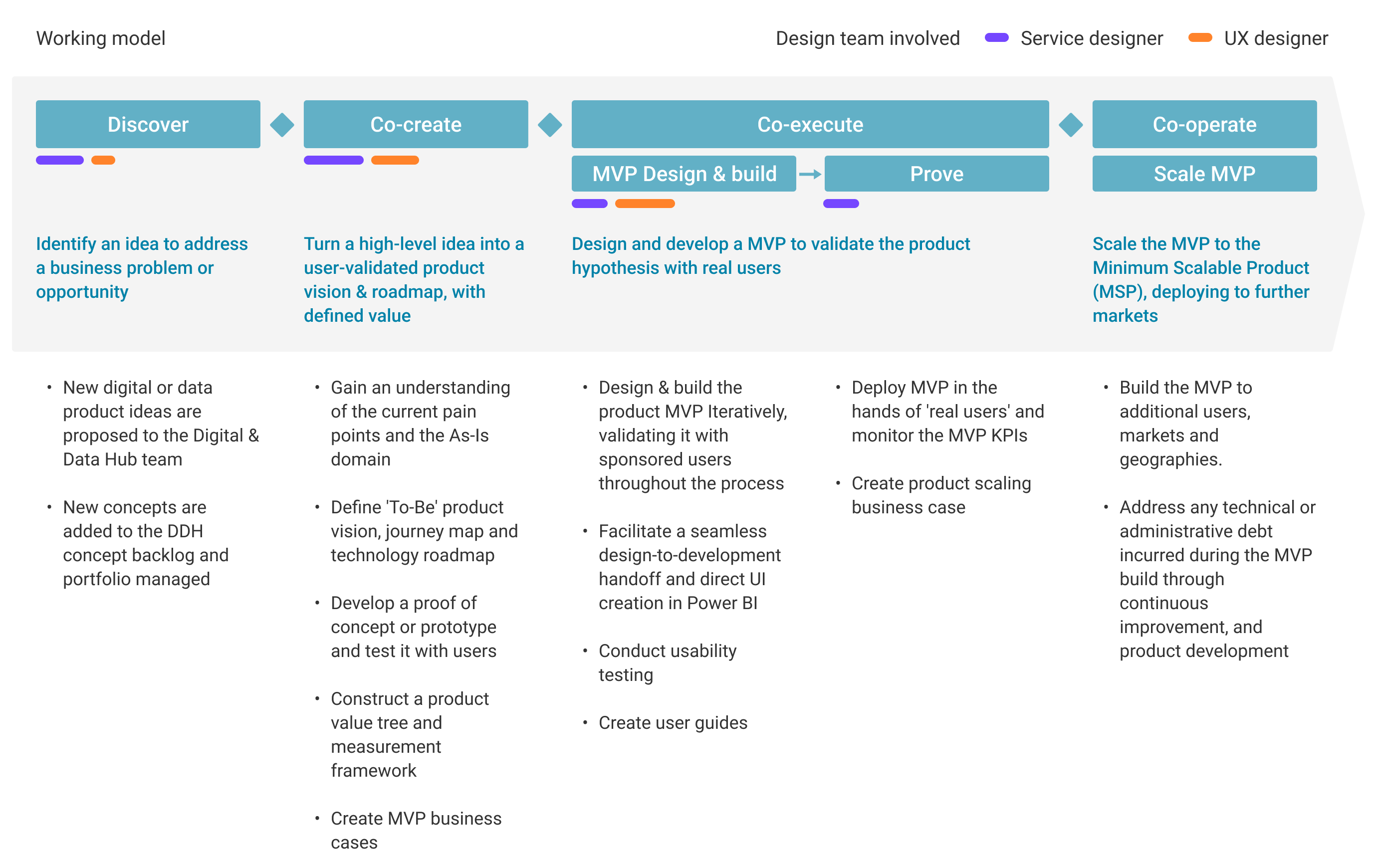
Garage working model for each DSS product
As a UX designer, I collaborated closely with service designers to ensure that our user-focused, iterative approach continuously delivers new digital and data products or services, generates business benefits, and meets user needs.
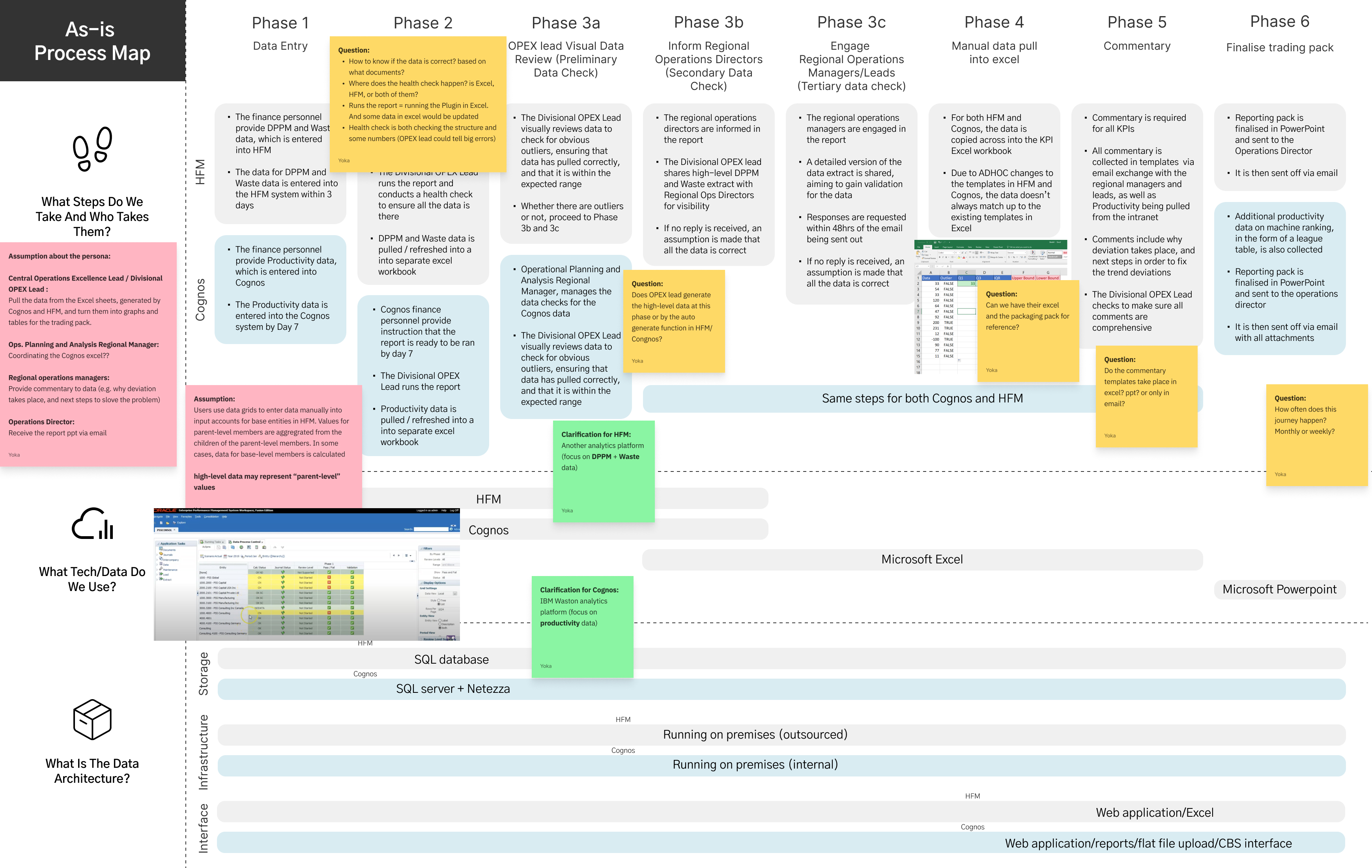
Understand the As-Is domain to identify current pain points
To make informed decisions and plan operations effectively across their 30+ countries, operational managers require quick and reliable access to KPIs from different locations worldwide. However, the current data reporting system involves multiple sources and presents data offline in Excel and PowerPoint, which raises concerns about data accuracy and reliability. To address these issues, we created an As-Is process map by identifying the current user journey and stakeholder interviews, that enable us to:
- Establish alignment on the technology and data used in each of the "As-Is" phases
- Gain a high-level overview of the data architecture
- Map pain points to each of the "As-Is" phases

Dive deeper into end user’s needs and generate ideas
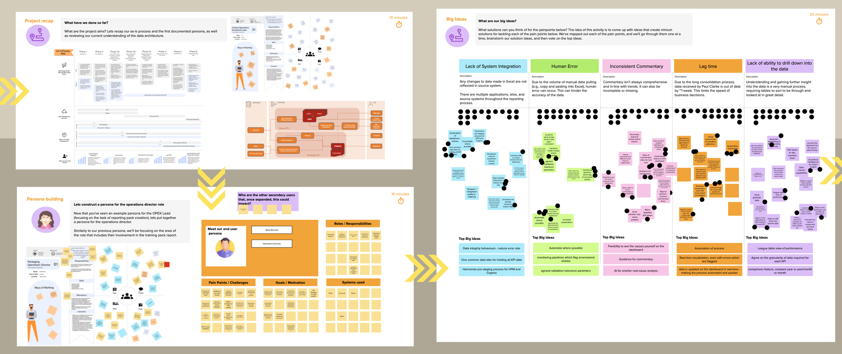
- Defined primary user persona
- Identified viable opportunities to address their pain points
- Prioritized and map those ideas on a value vs feasibility matrix, and create a to-be journey map to understand how these ideas will fit into the user experience
- kicked off to visualize the dashboard by determining which graphs, tables, and data will be included in the final product
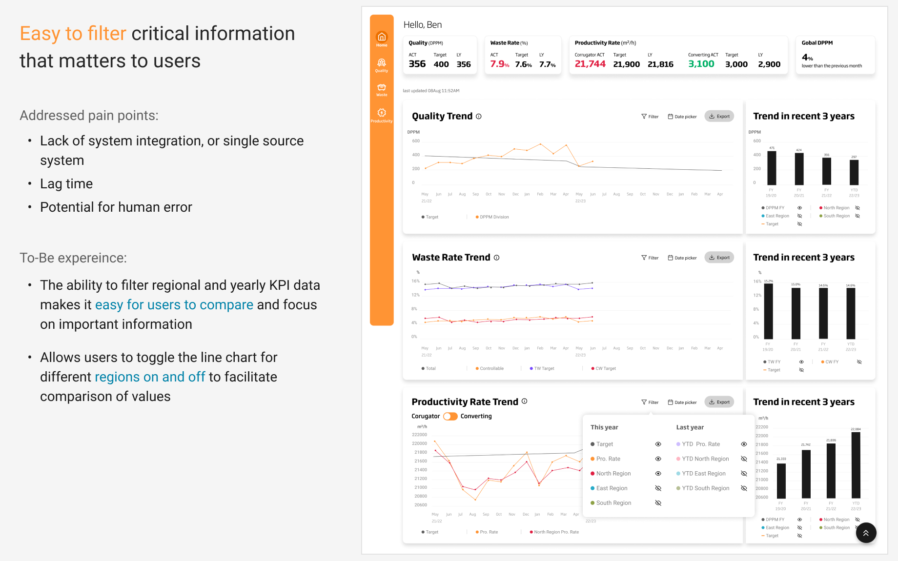
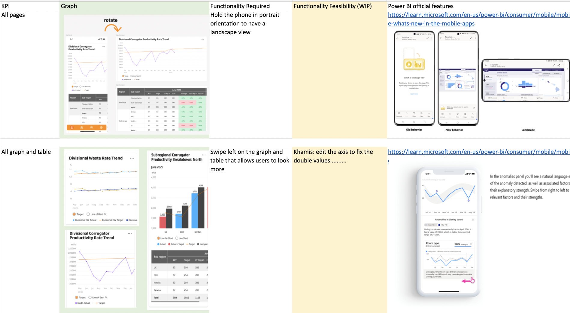
Enhance user access to relevant information
We developed IA to categorize content for the three levels (region, subregional, and site) according to each KPI (quality, waste, and productivity). This creates clear logical hierarchies and an intuitive navigation structure, enabling users to find relevant information easily. We also utilized user feedback to identify essential data visualization tools such as location filtering.
Align UX with user goals and business strategy
After creating low-fidelity wireframes in Figma, we held a regular group discussions to ensure that the design decisions and rationale aligned with both user and business goals.
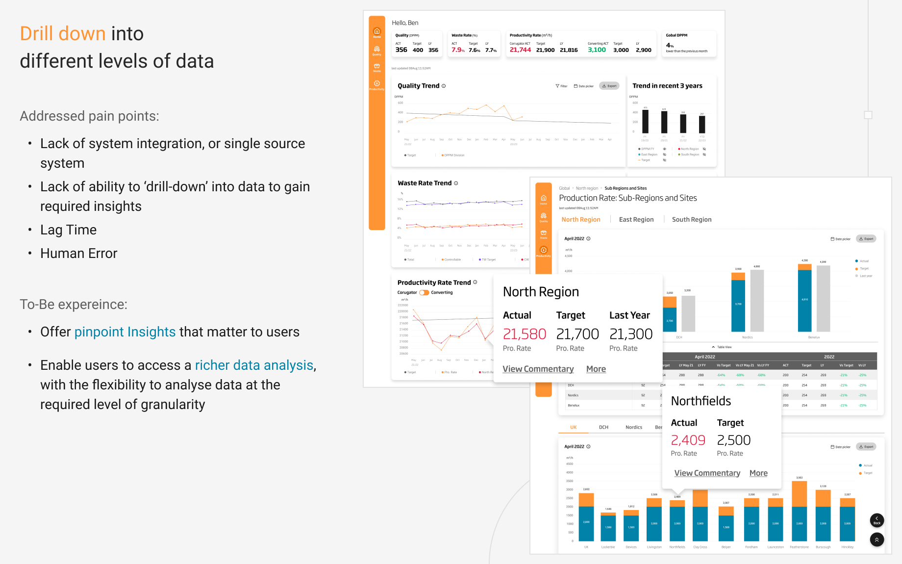
Address pain points with targeted interaction design
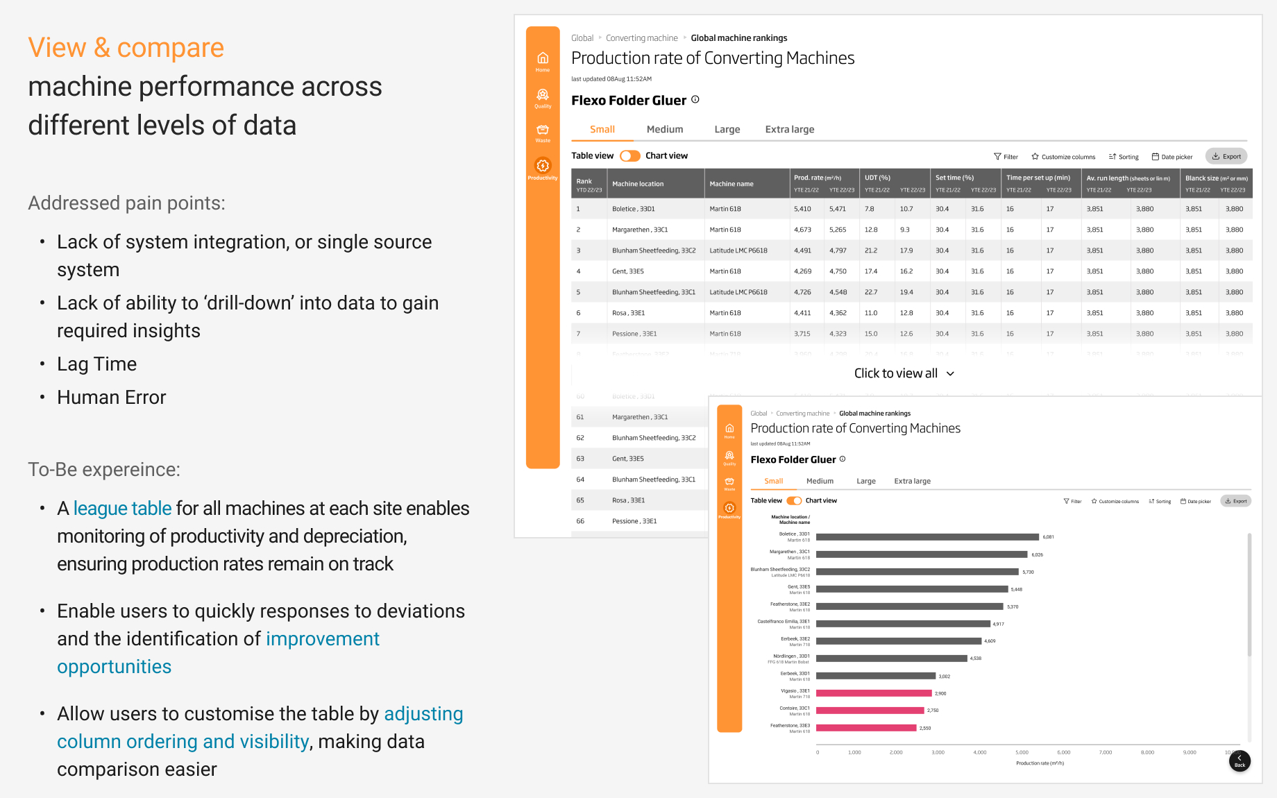
Drive business value with dashboard design principles
- Provide users with immediate access to the data that is most relevant to their business objectives through polishing and strengthening drilling down into data experience
- To avoid cluttering the screen with a wide variety of charts and tables, sticking to a minimal selection of visualisation types to maintain a consistent look throughout the dashboard
- Keep the design simple and easy to understand to make it as easy as possible for users to analyze the information on the screen
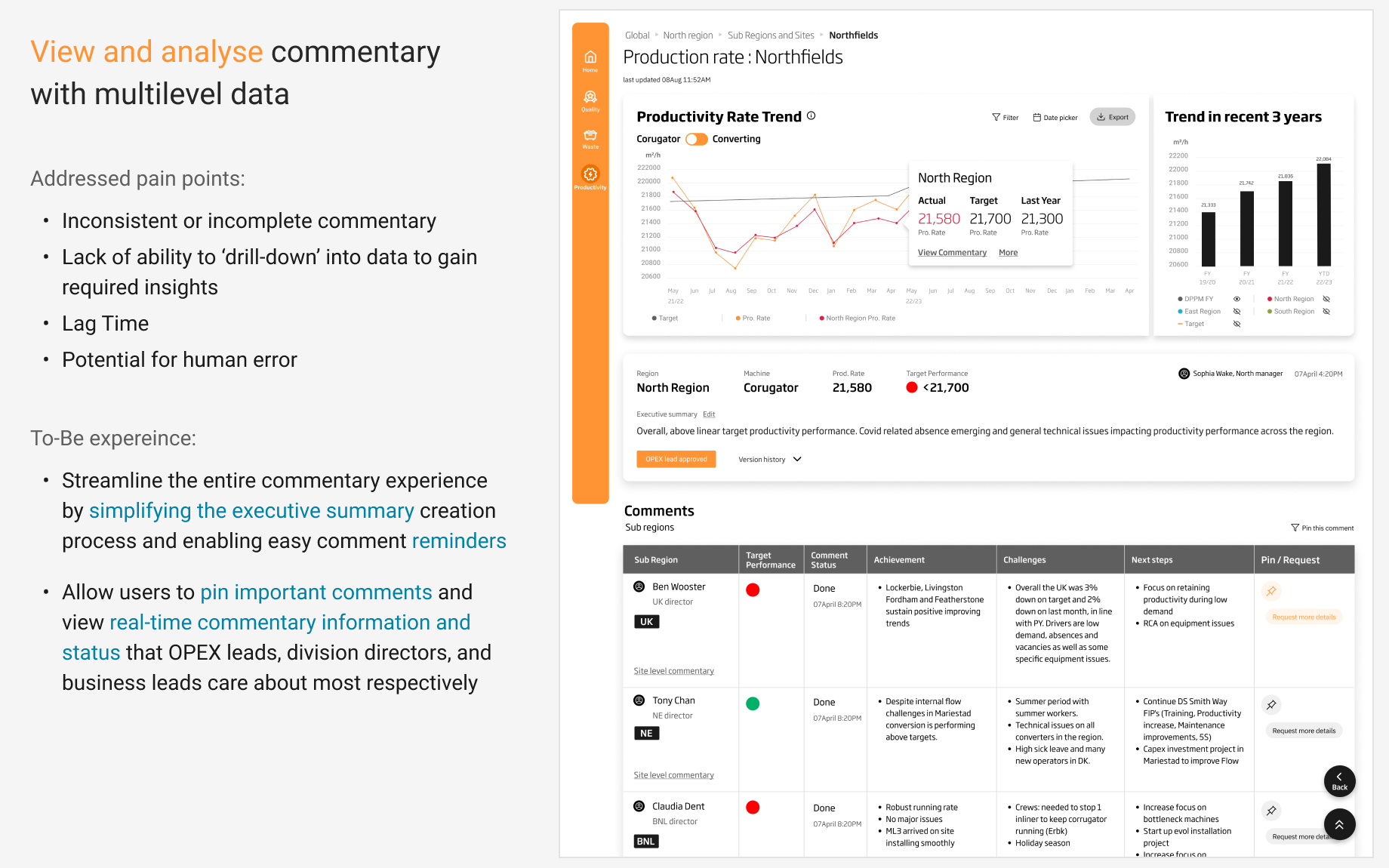
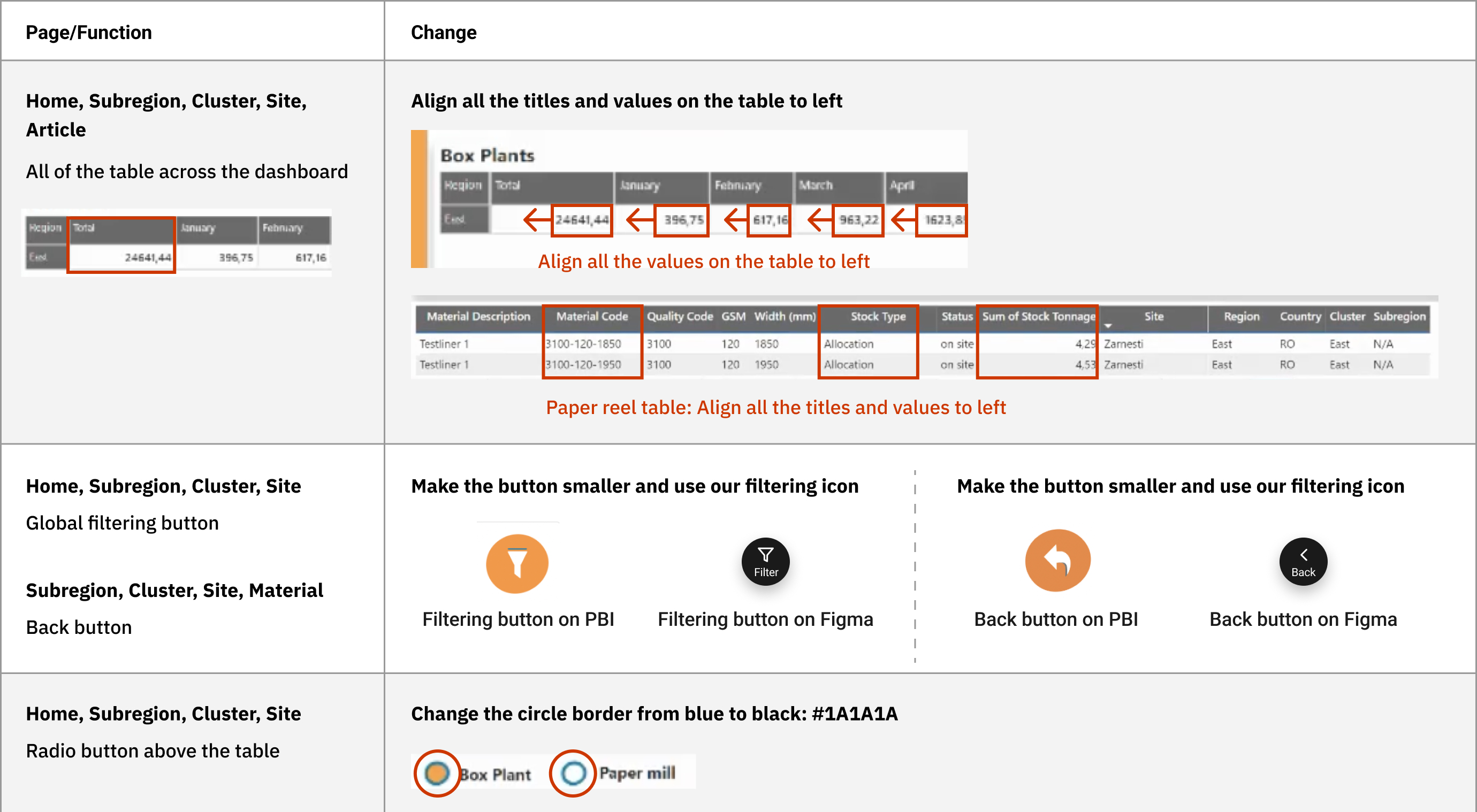
Evaluate the design by understanding how real users interact with the dashboard
To ensure ease of use and overall user experience, we conducted usability testing with five real users and monitored their interactions as they completed a series of tasks.
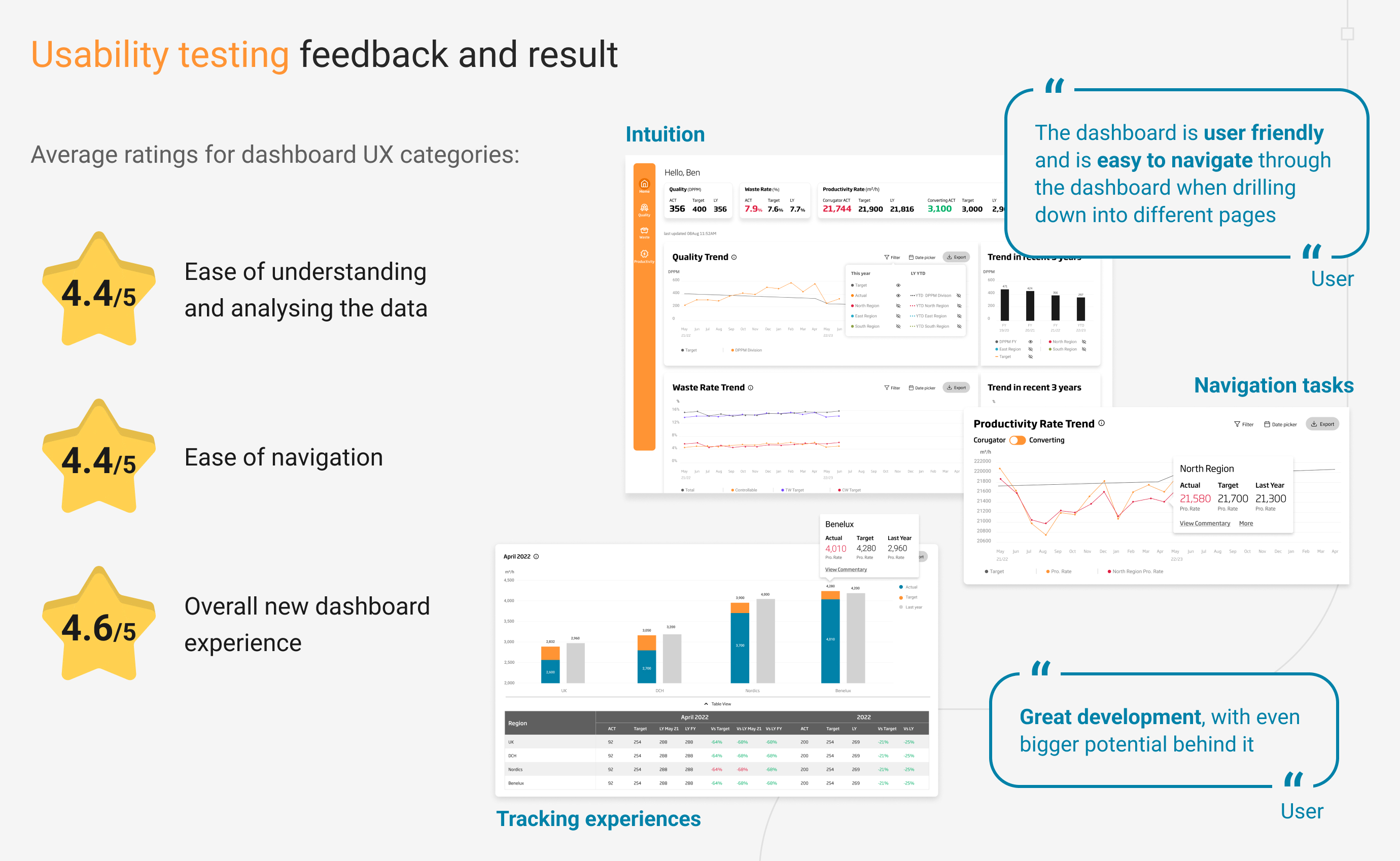
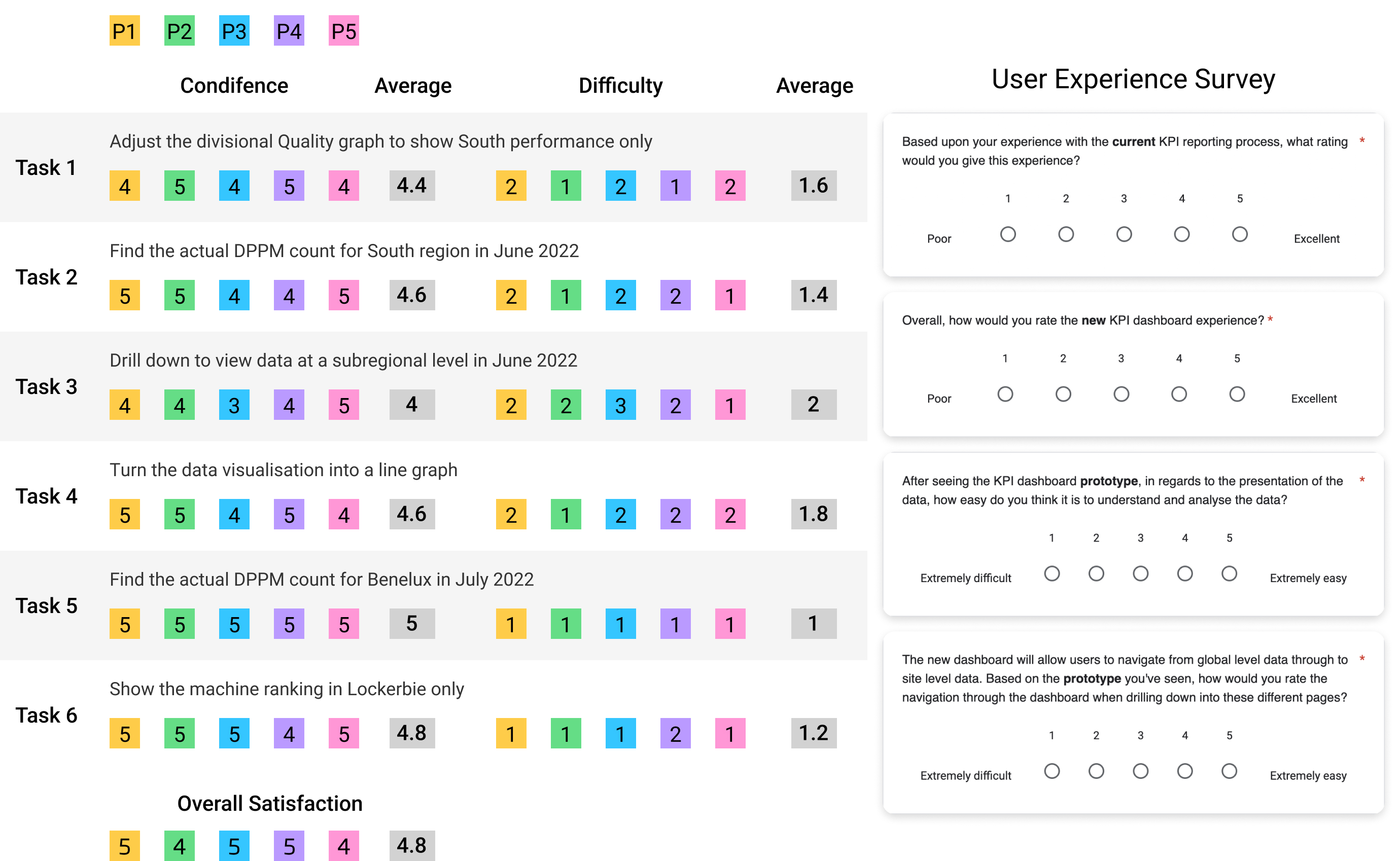
After the testing, we gathered their feedback through surveys. Based on the detailed qualitative and quantitative feedback we received, we made several improvements to the design. These included:
- Defining location colors to make them easier to identify
- Refining the wording to make it easier to understand
- Adding feature enhancements such as breaking down the data

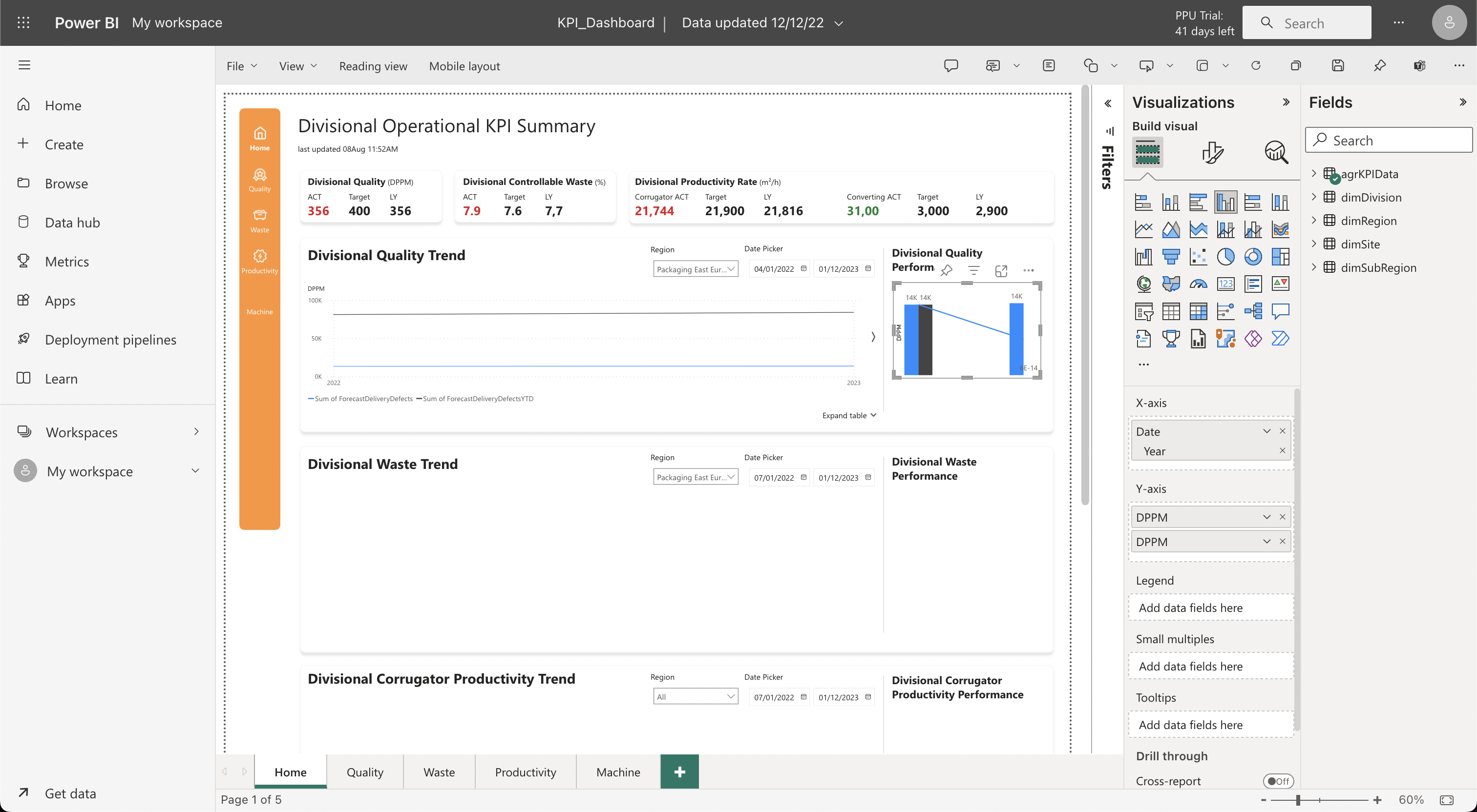
Facilitate an effective handoff of the design to PBI developers
I have outlined the crucial steps that the design team must follow when using Power BI as their development tool:
- PBI functionality validation
- Empower developers with Figma
- Walk through wireframe and prototype
- Regular review of the front built by the developer on PBI
- Create UI directly on PBI (depends on the development team's availability to handle the layout work and the project timeline)
Takeaway
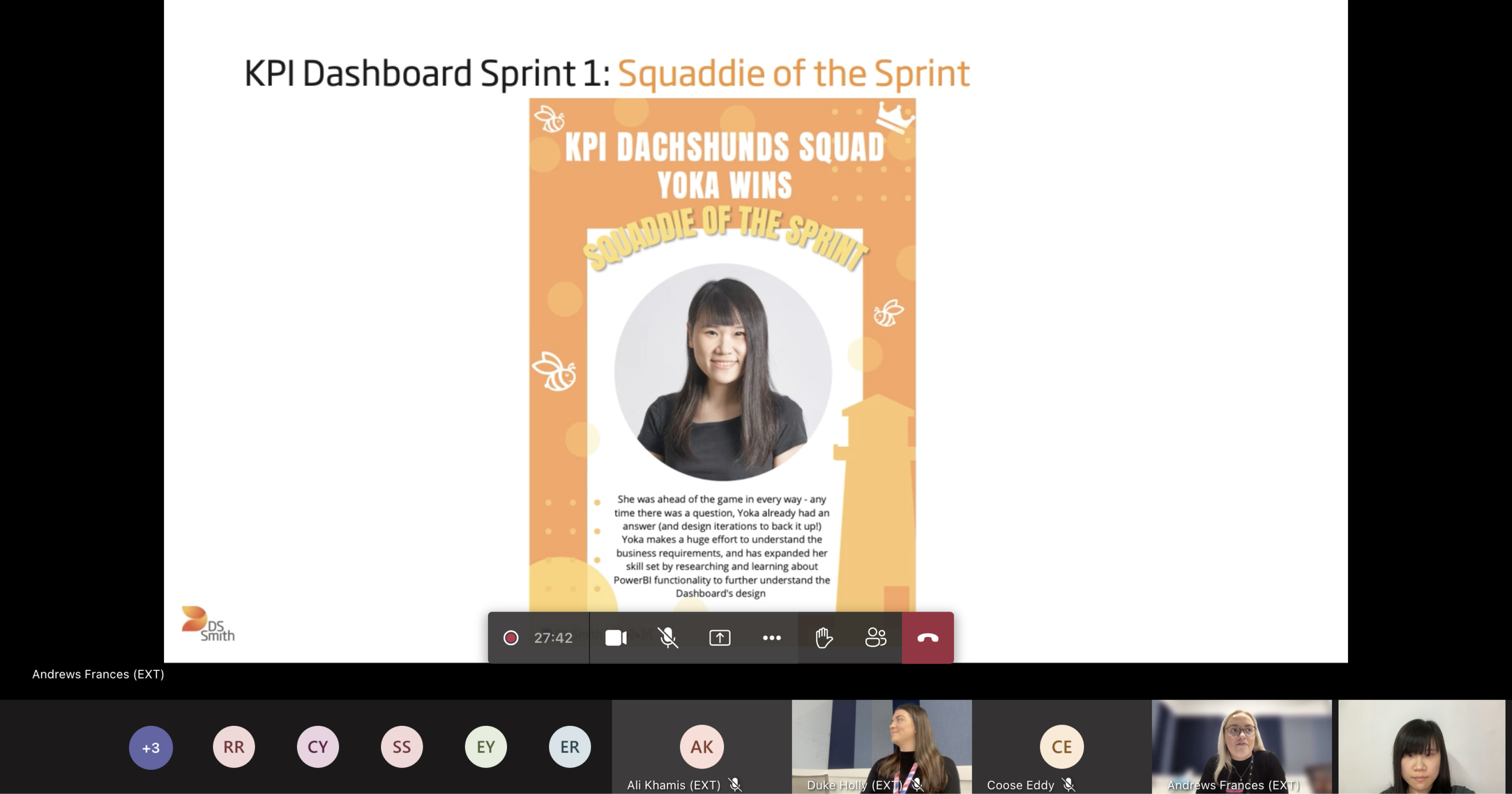
I am fortunate to have been recognized by my team for my contributions, which is reflected in my achievement of winning an internally voted award twice. Working with my squad teammates in the UK and India, despite the challenges of different time zones, was an invaluable experience. When the Power BI developer was overloaded with tasks, I took the initiative to seek approval from the squad lead and learned Power BI concepts to directly create the UI in Power BI with the developer together, which maximized front-end development and closely matched the design. This experience provided me with valuable knowledge about Power BI and developed my confidence in taking an active role in collaboration, especially when the development team is limited in availability for layout building.
