UX design: User flow and wireframe flow UI design: Design system, UI mockup and UI testing
External: Product owner, IT Business Analyst
To comply with my non-disclosure agreement, I have omitted and obfuscated confidential information in this case study. The information in this case study is my own and does not necessarily reflect the views of OCBC Wing Hang Bank Limited.
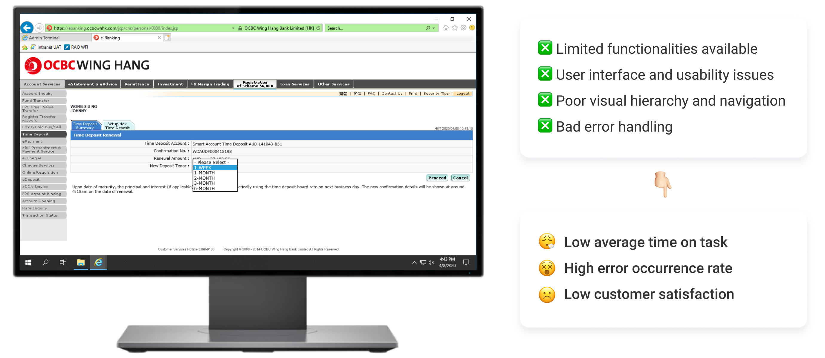
Fundamental usability is challenged, falling way behind industry standards
OCBC has long been recognized for its outstanding customer service in the offline world. However, its online banking experience failed to live up to the same high standards and was far behind industry norms. The As-Is customer journey was unpleasant and frustrating, with poor usability that made it difficult to scale and implement new business initiatives in a timely manner.
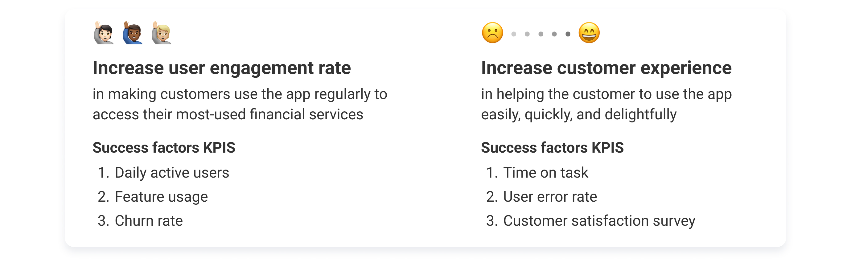
This situation offered us a unique opportunity to enhance OCBC's online banking services in Hong Kong. Our goal was not only to digitize their banking products into a user-friendly B2C mobile application but also to ensure that customers could complete tasks successfully and without errors, thus increasing their satisfaction. We are thrilled to see that since the launch of the new app, retention rates, and daily active users have steadily grown. This success story is a strong testament to the power of user-centricity and its ability to drive the success of digital banking.
Reduce churn rate by improving UX
The website offered essential functions for online banking, but they were often overly complicated and led to broken experiences. Tasks such as transferring money and paying bills had numerous limitations, which created difficulties for users. The following key issues contributed to the overall complexity of online banking:
Value drivers
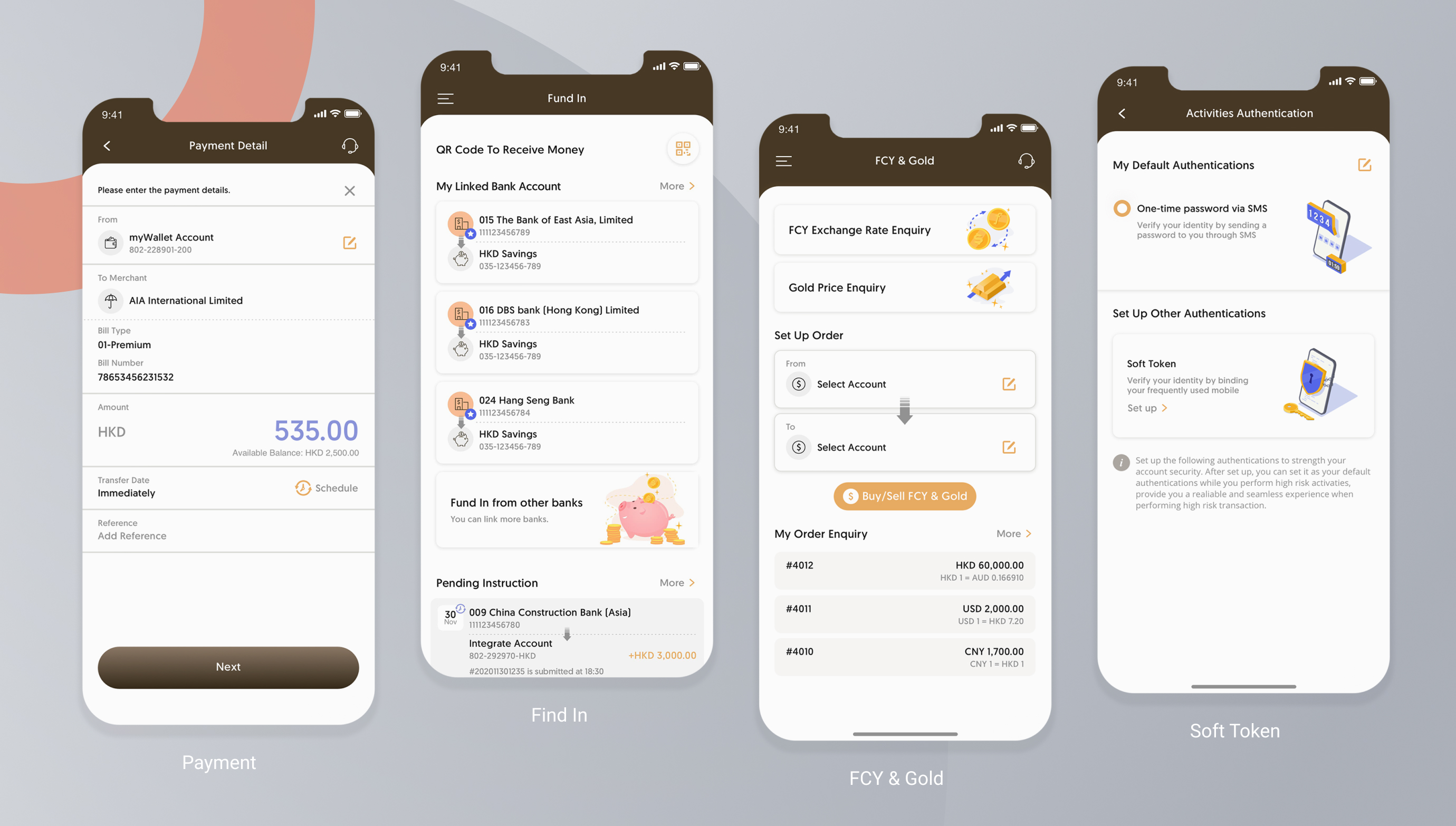
20+ major core functions were implemented
Scrum working model for each core function
My role included working closely with cross-functional teams, particularly BAs and frontend developers, to ensure that sprint goals and all deliverables in a Scrum environment were aligned. This involved product backlog refinement, prioritization of the to-do list, and scope and effort estimation. Additionally, I engaged with the product owner and technical teams from the client side daily to respond to market changes.
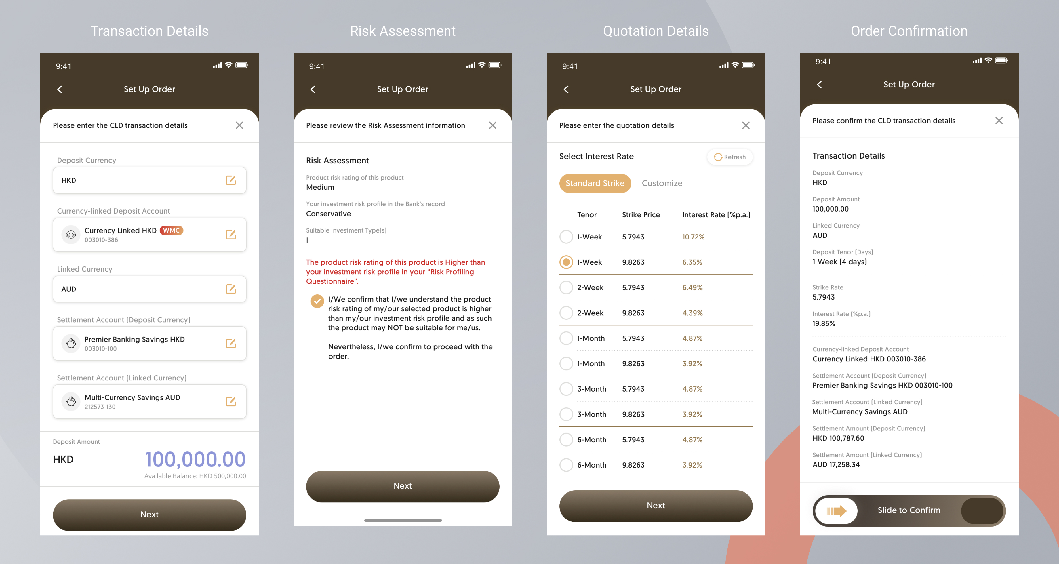
Case study: Currency-linked Depositp
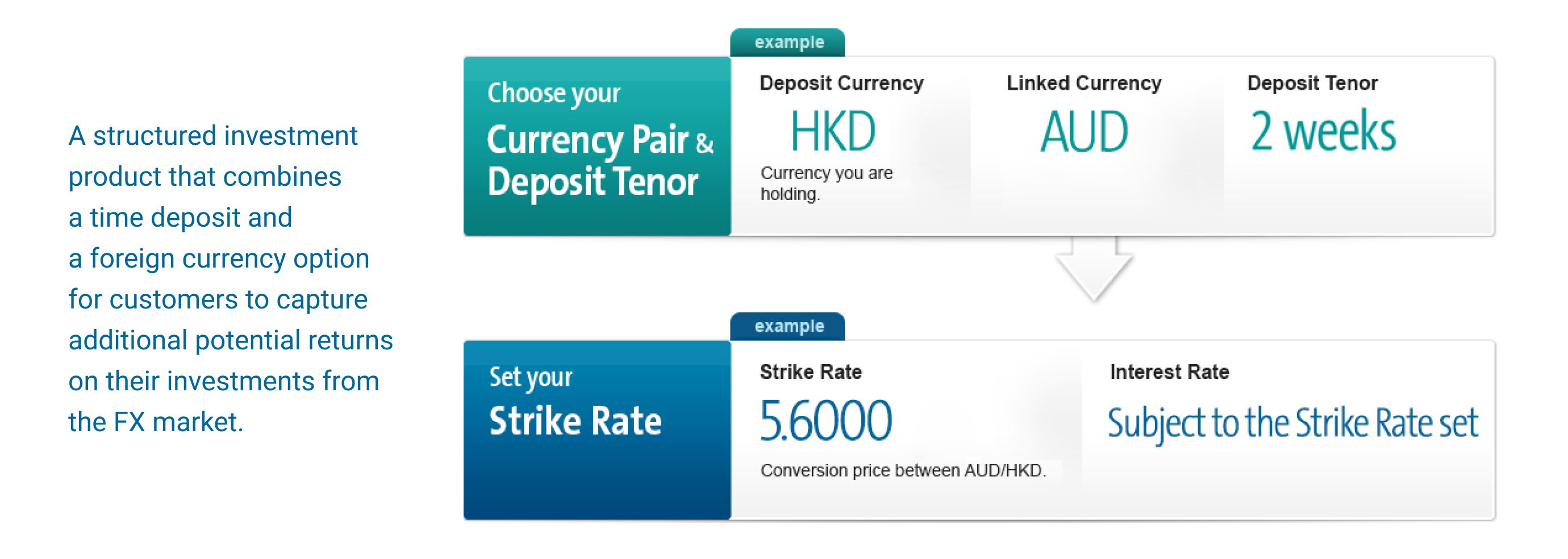
I struggled to comprehend CLD's features and business logic initially. To overcome this, I sought help from the BA and conducted market research together. By leveraging the expertise of others, I can have a better understanding of the bank's current business processes and identify areas for improvement, allowing me to contribute more effectively.
Complicated experiences frustrate users
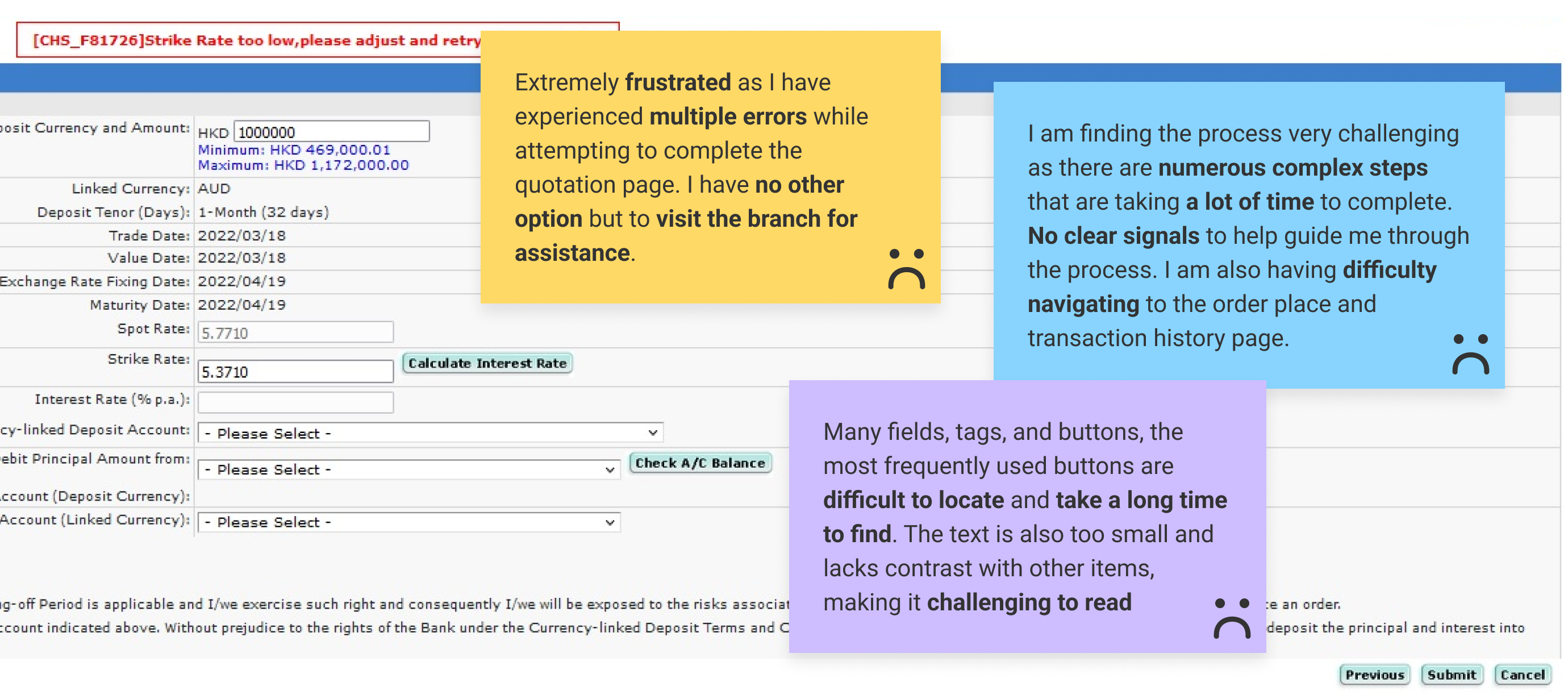
❎ Confusing transaction procedure and status
❎ Confusing user interface with the overabundance of click targets
❎ Bad visibility of investment risk that is not legible and decipherable
❎ No noticing and tracking failures to discover unexpected errors
Redesign user flows to reduce inefficiencies
We analyzed the As-Is user flow to identify pain points and inefficiencies, then created a To-Be flow that enables users to achieve their goals with ease and minimal frustration, while still achieving the desired business objectives.
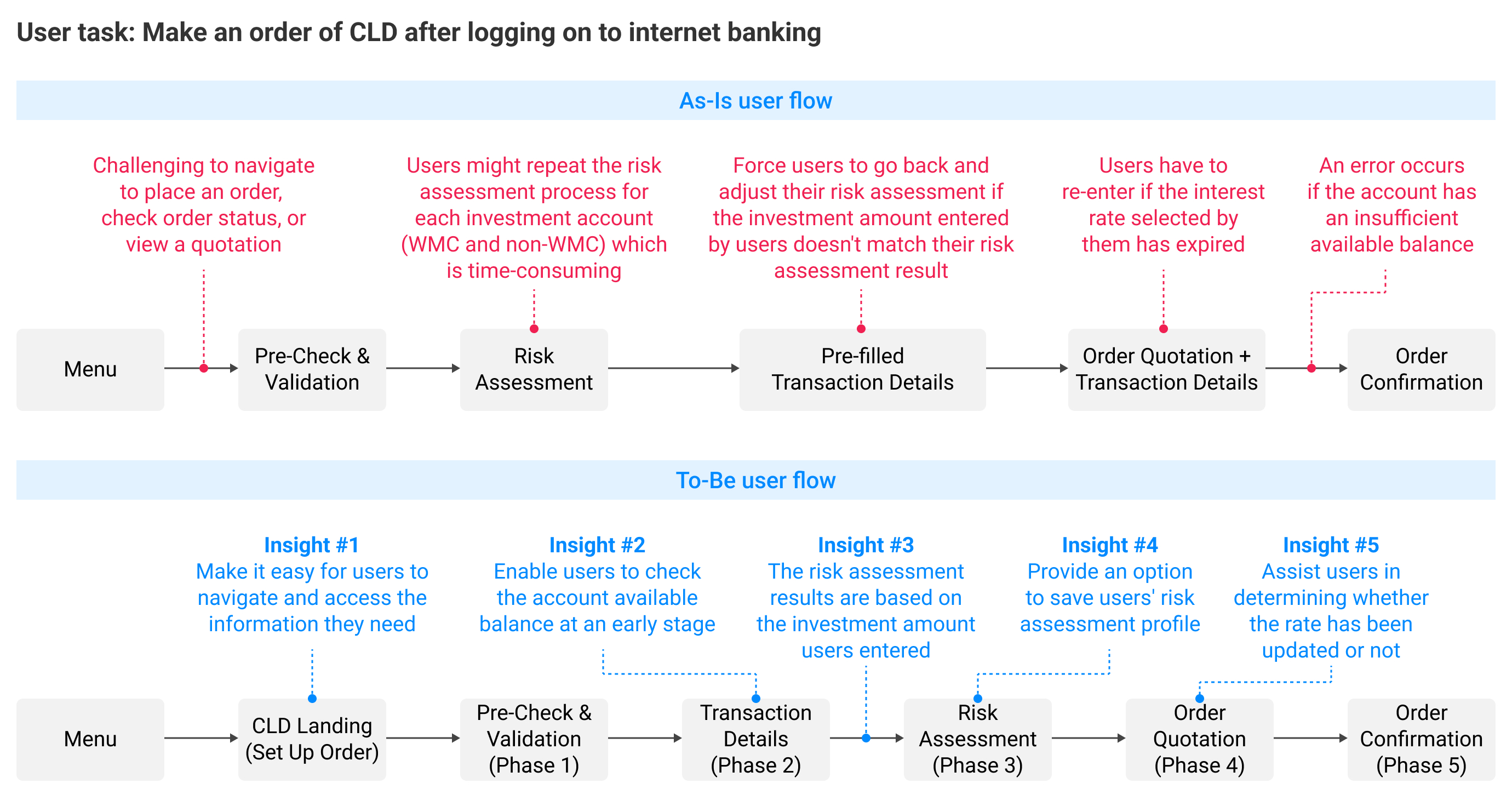
By mapping out each step, we identified opportunities for improvement. For example, we reduced the time users spent trying to overcome obstacles by clearly communicating errors and providing guidance on resolution.
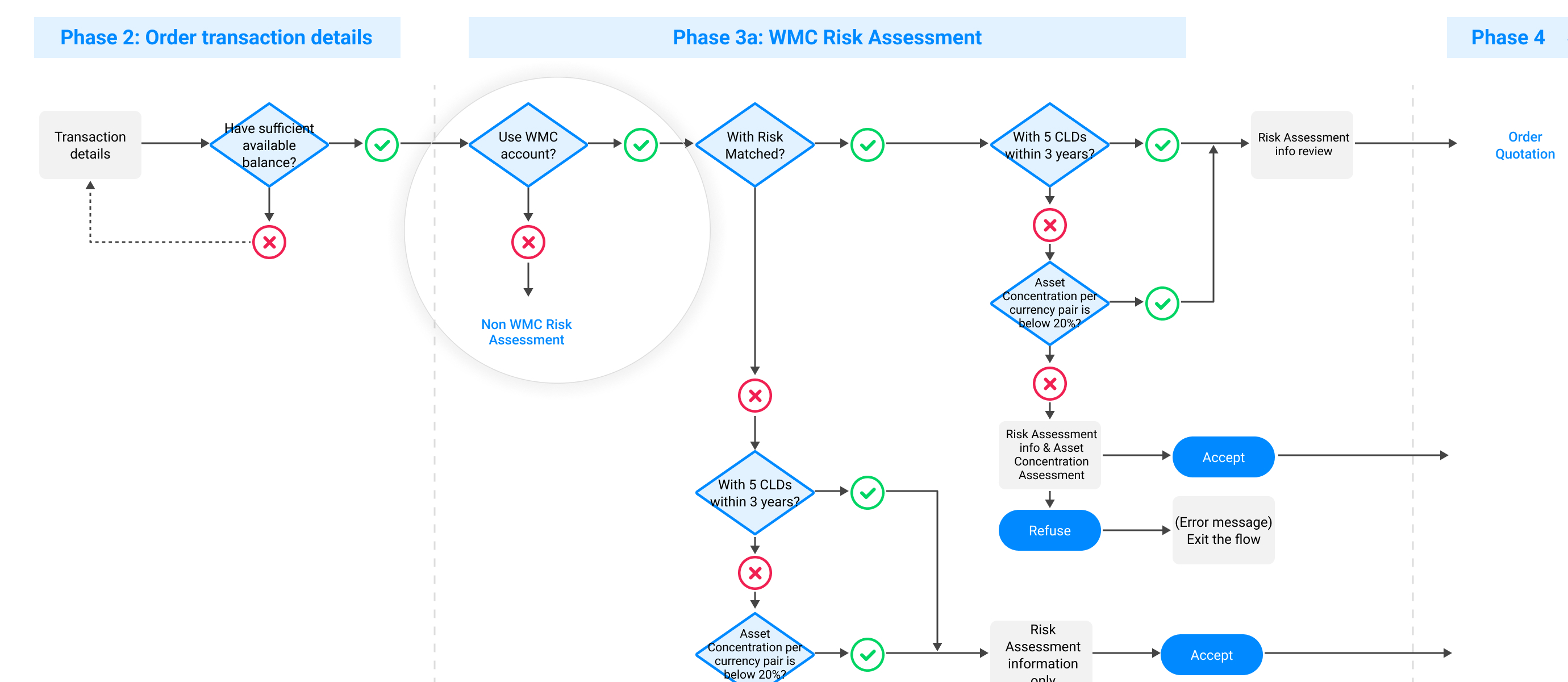
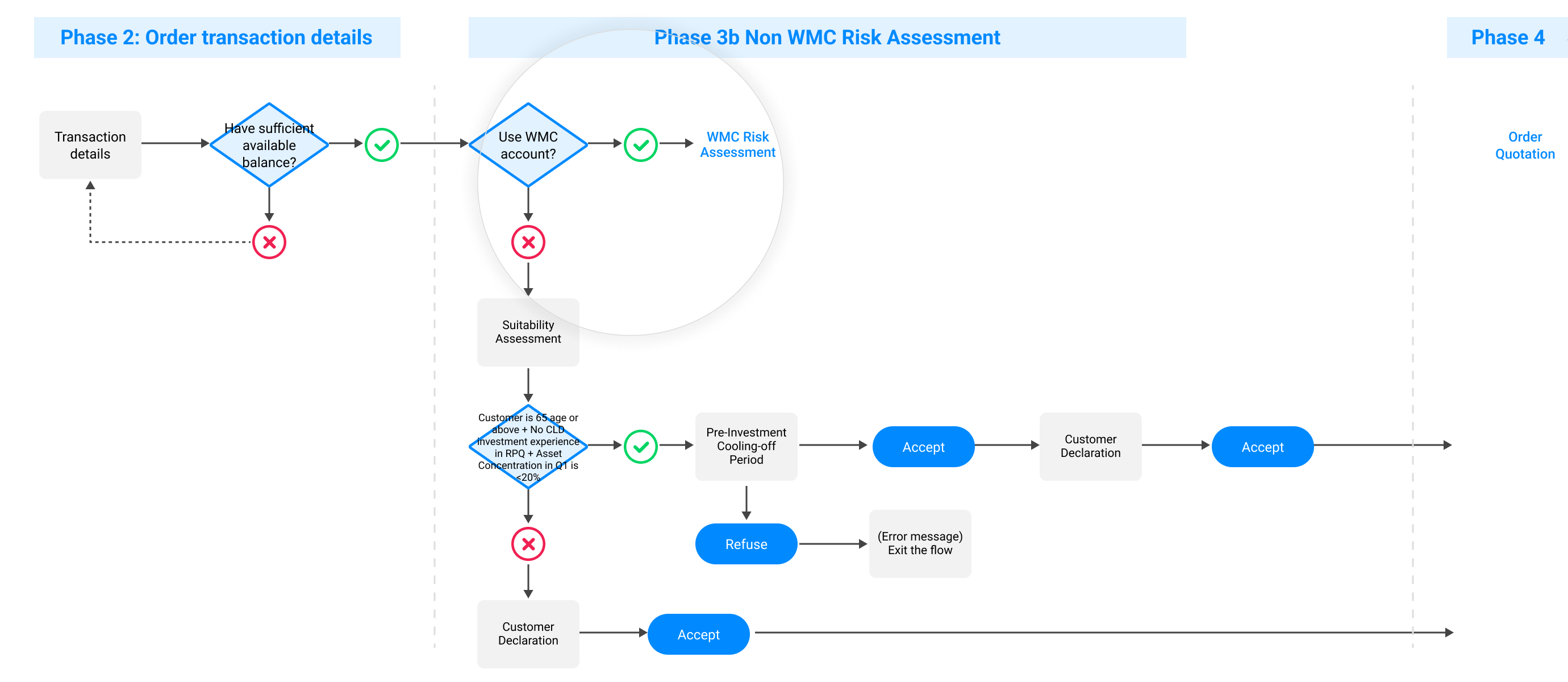
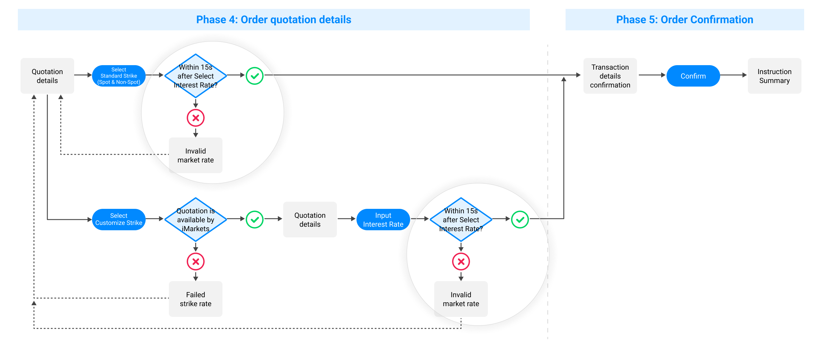
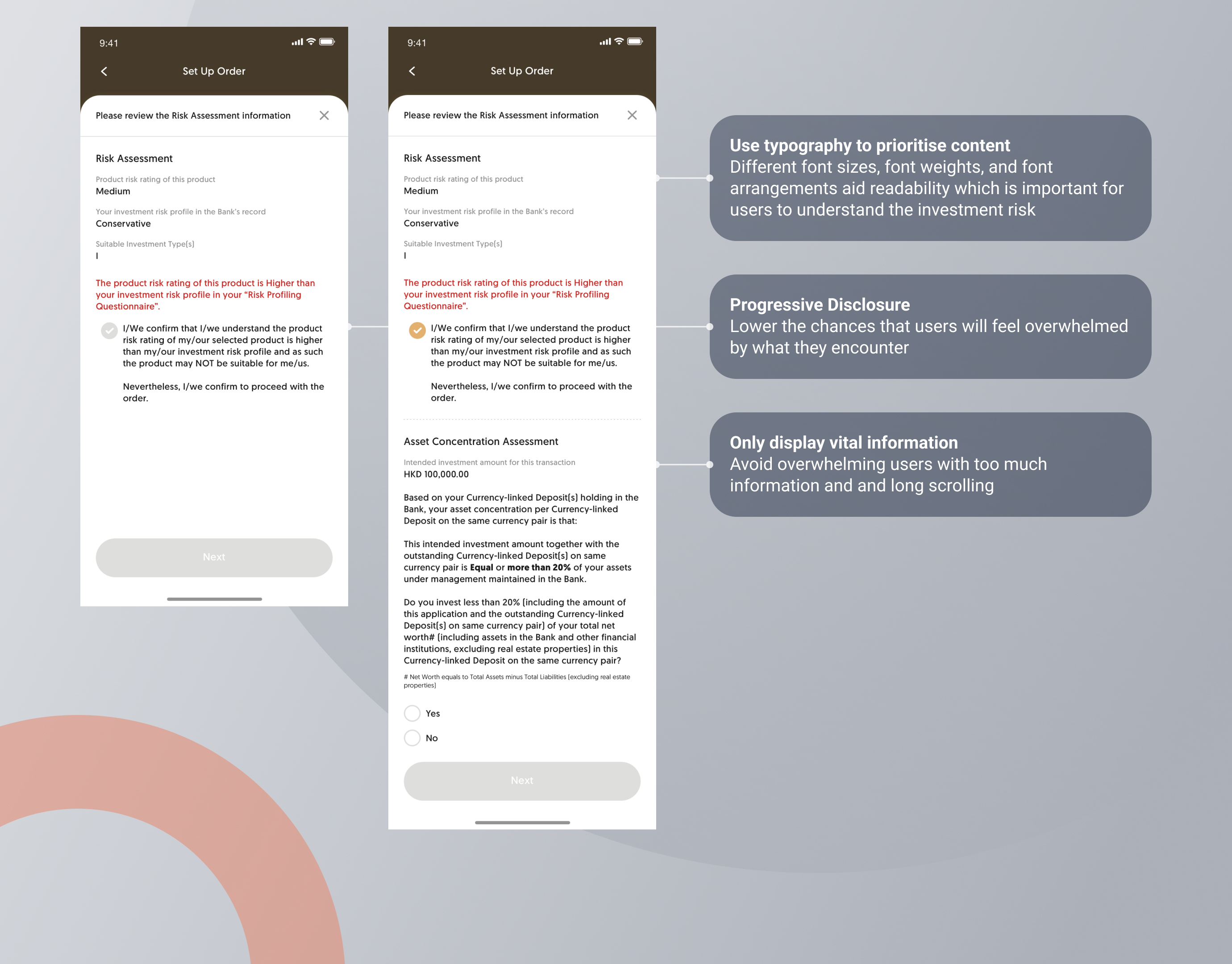
Prevent user errors through early detection: ensuring accurate task completion
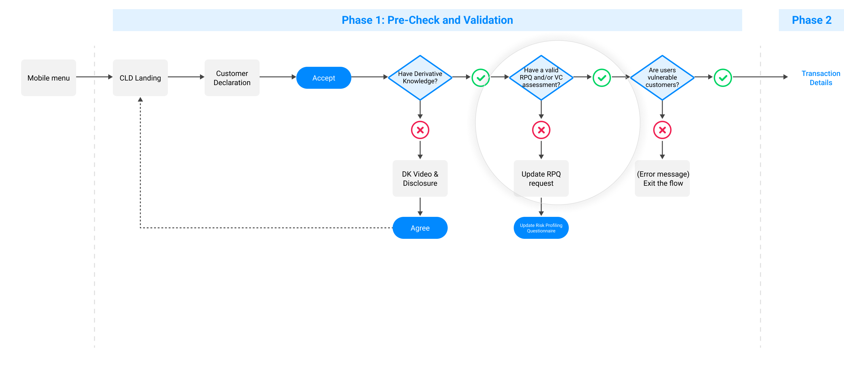
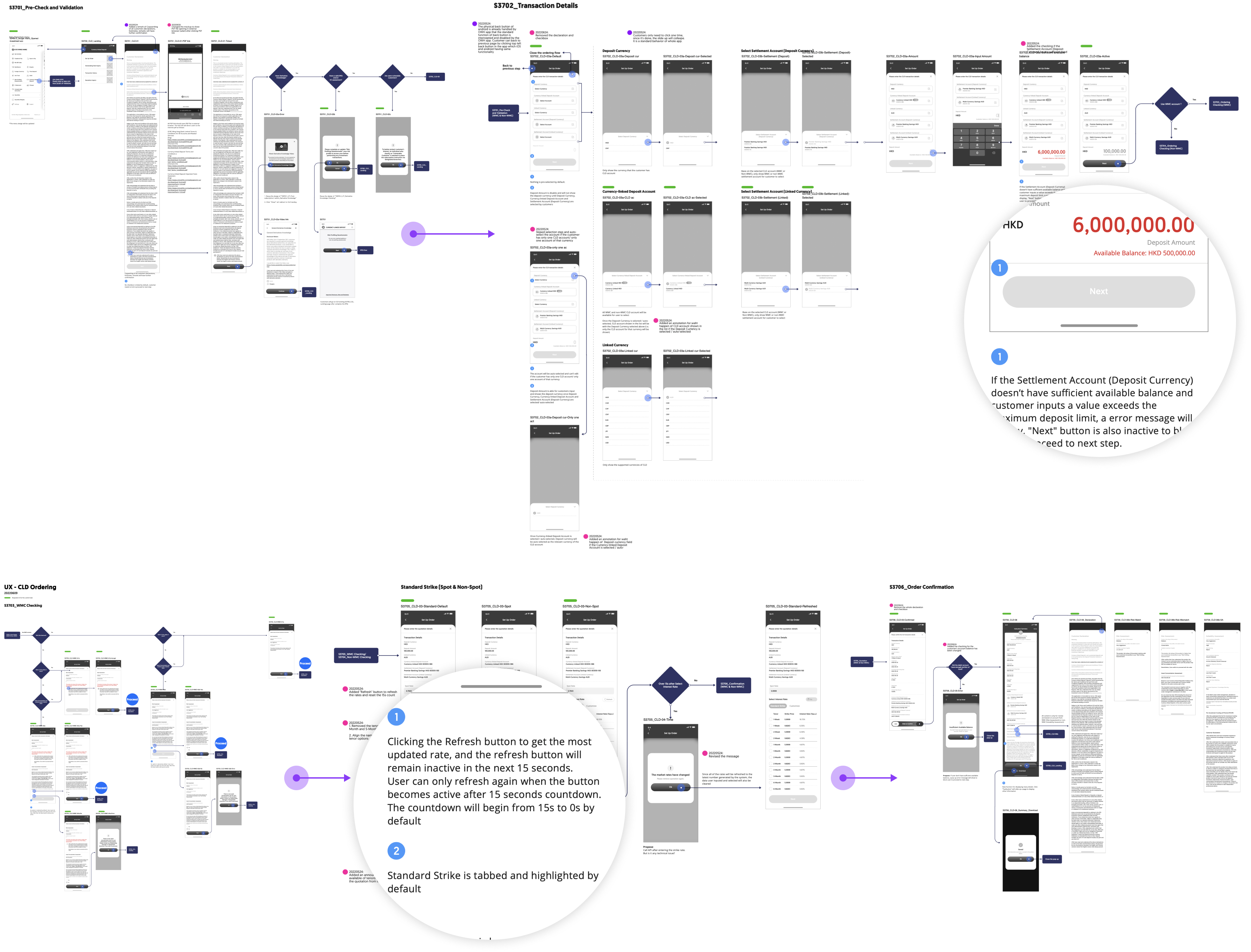
Translating the user flows of 5 phases into high-fidelity wireframes. These wireframes were then used for user testing and validation with stakeholders, with a focus on improving product usability, specifically in terms of error handling. To minimize any confusion and back and forth with the team, I included annotations and design rationales within the wireframes, which enabled clients and developers to have a clear understanding of all interface elements and how users interact with the product.
Optimize design for efficient task completion by users
We conducted a usability test that simulated real-world usage to identify user pain points, gauge interest in potential features, and prioritize them. We analyzed the results of the test and user interviews to compile themes and evaluate our design.
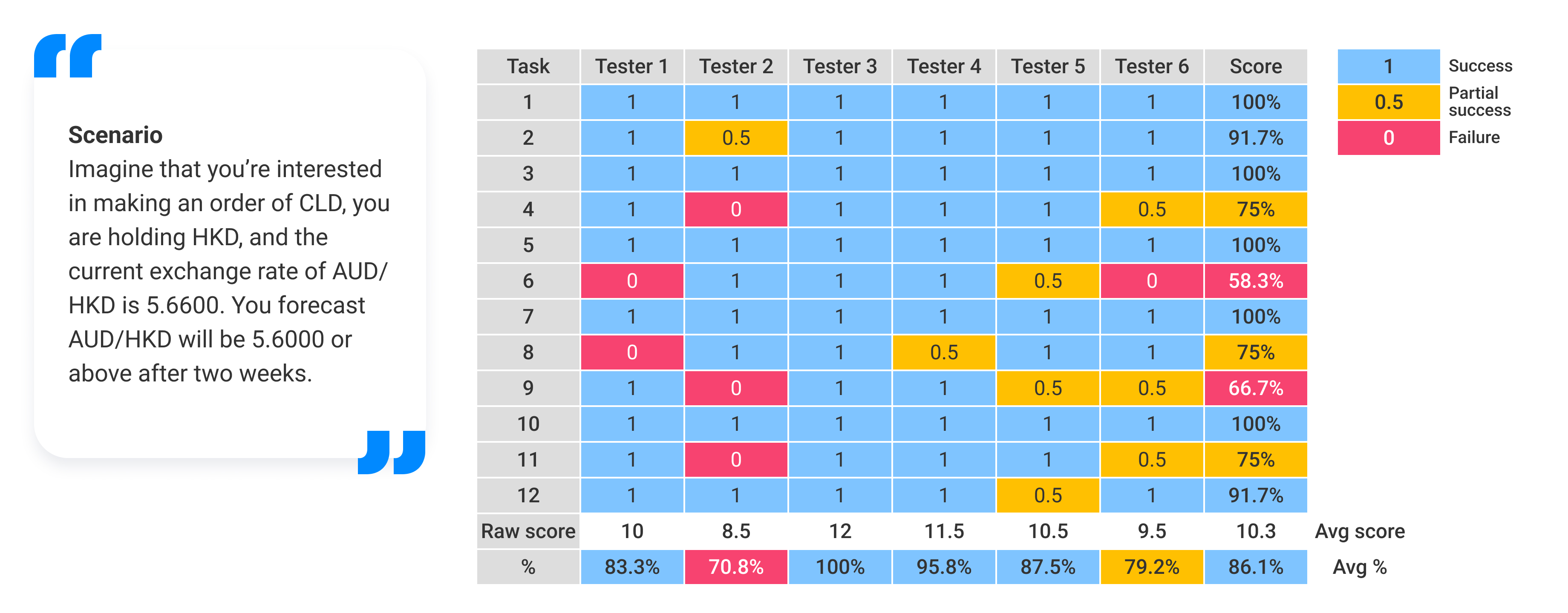
We integrated the findings into the final UI mockup to be handed off to developers.
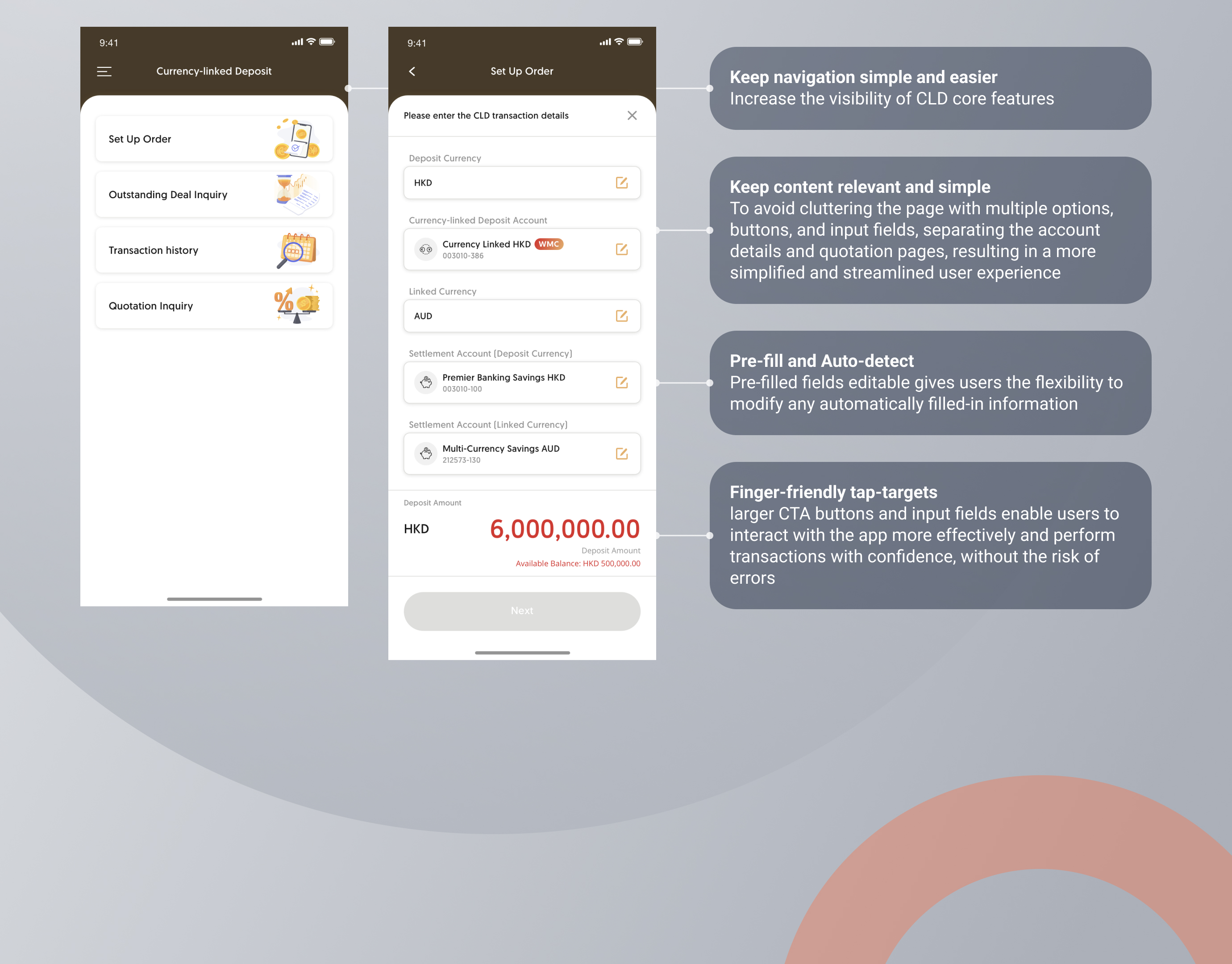
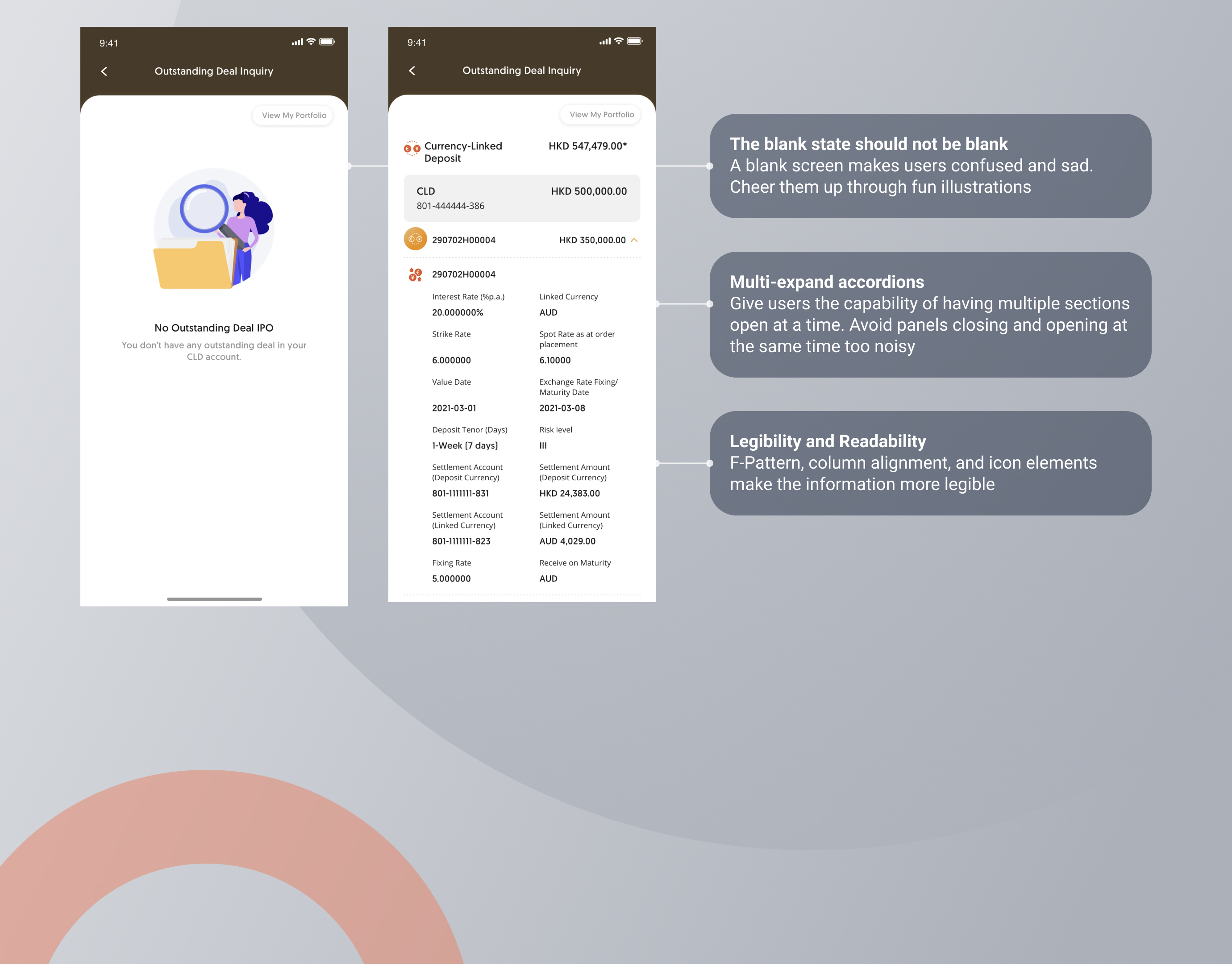
Key changes:- To prioritize users' needs and increase discoverability, the "Place Order" option has been moved to the top of the landing page
- A visual indication has been added to help users differentiate between different account types when placing an order
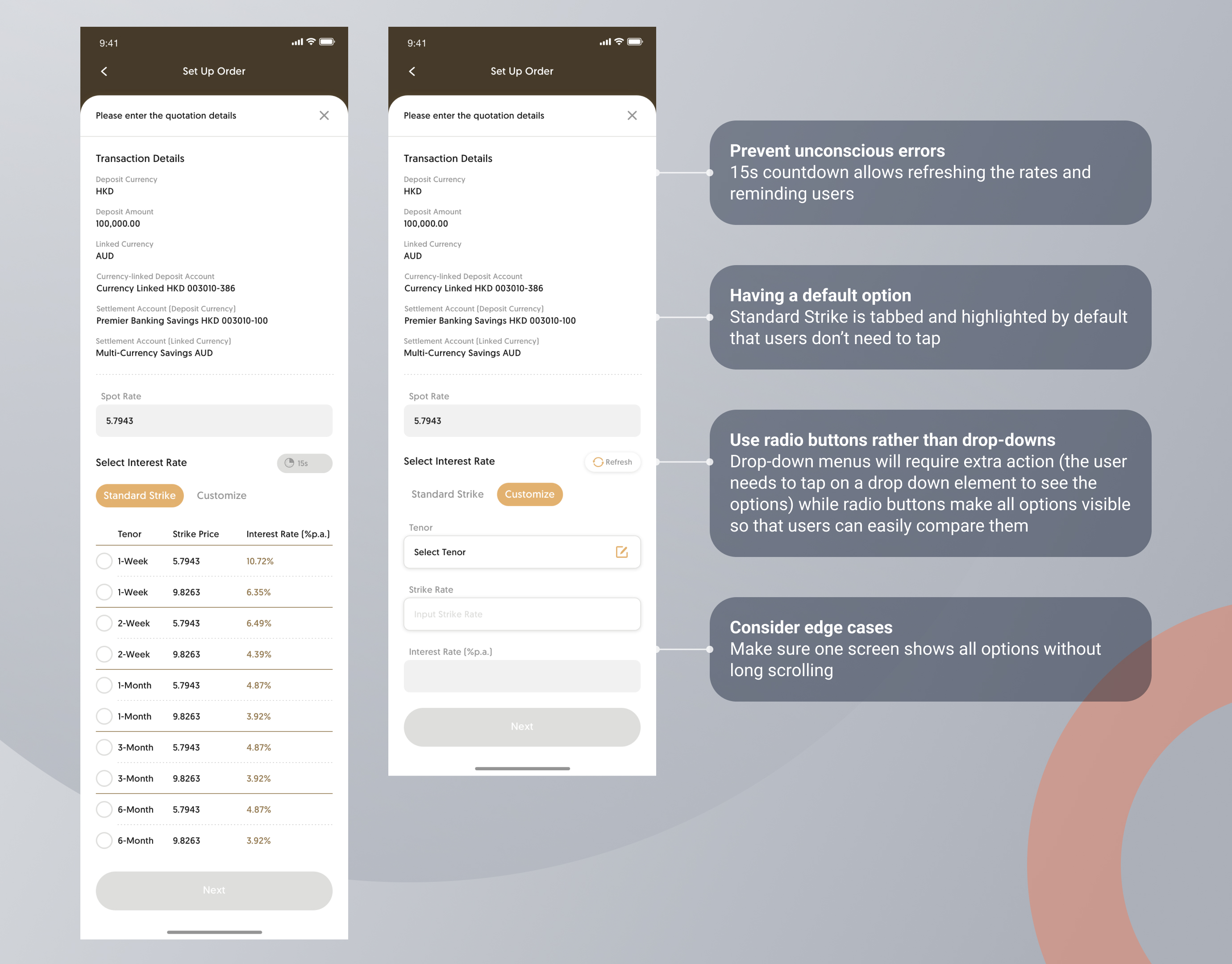
- Allowed users to continue their selection when the timer is reactivated
- Provided a connection between the page of order confirmation and outstanding inquiry so users are able to check their order status immediately
Minimize complexity through intuitive user interfaces
Intuitive design is crucial for minimizing the time it takes for users to complete their goals, reducing frustration, and increasing efficiency. To transform complex products into lightweight user experiences, we have employed several techniques, including:
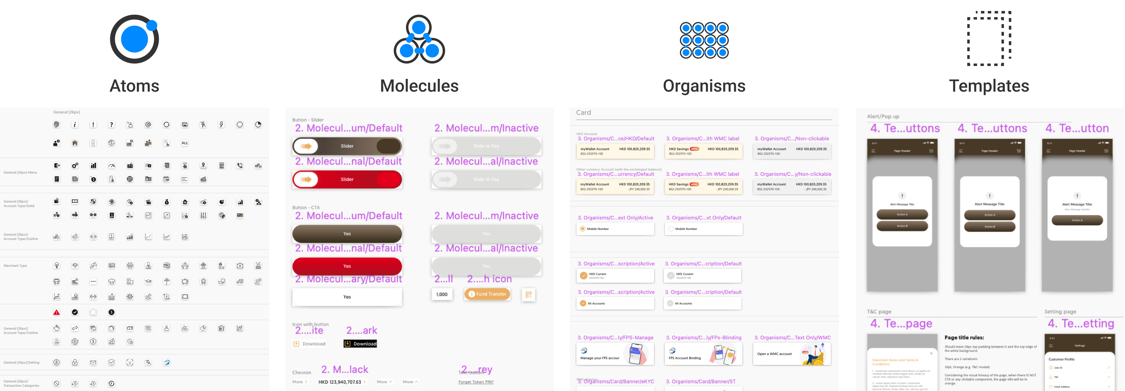
Streamline learning with a consistent experience
We created a set of design patterns and components for consistent user experiences and scalable design management. We also established mobile app principles and best practices to guide our design process. This approach saves time and money, streamlines collaboration, and improves the design-to-development handoff process.


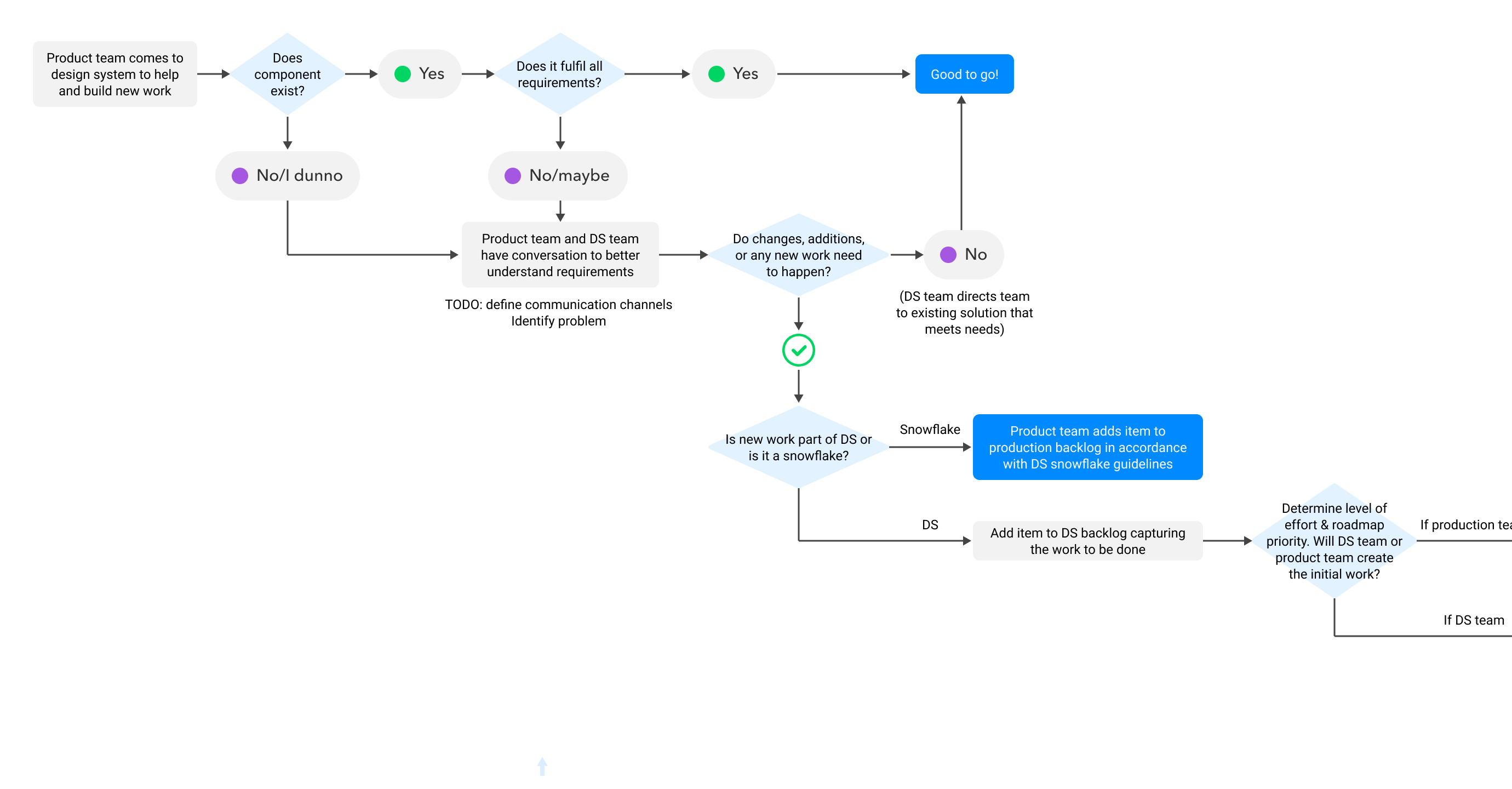
Governance process in DS team and product team
To ensure the design system is maintained efficiently, it is crucial to adhere to governance standards that address four primary scenarios, including ntroducing new elements, promoting patterns, reviewing and adapting patterns, and releasing design system updates.
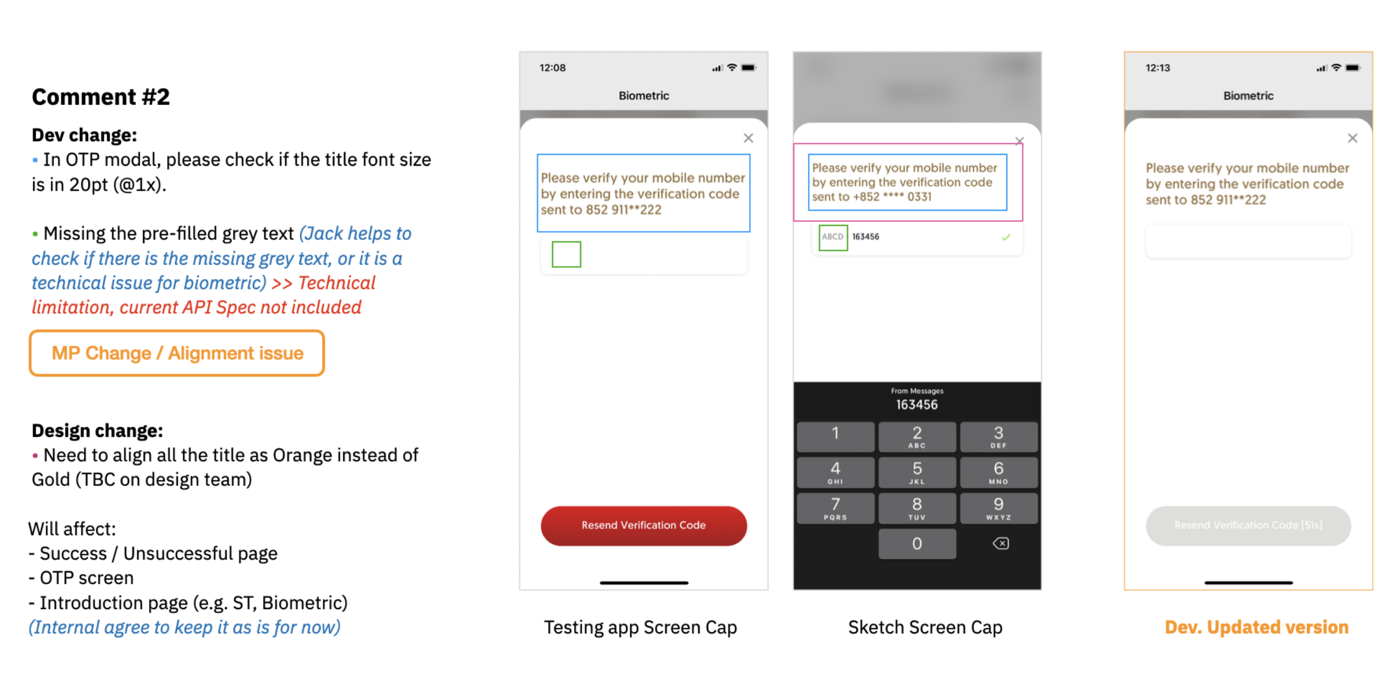
Perform UI testing when handing off to developers
Whenever UI composition has been completed, we would check each screen's controls, visual elements, and components, such as color, fonts, action buttons, text fields, checkboxes, and menus, to identify and resolve any potential defects and bugs, and also ensure they functioned properly and met expected performance standards.
Final result
During 2 years, we have established trust and a strong relationship with our client. Our UX strategy is designed to not only delight users but also align with business objectives. To achieve this, we consistently measured UX success and app engagement metrics with Google Analytics. The gradual rise of daily active users and user engagement rates leads to retention, which indicates there is an alignment between business goals and product design and development.
Takeaway
Working on a banking project was an invaluable experience for me as a UX and UI designer. I collaborated with an interdisciplinary team to tackle the unique challenges of the banking user experience. Regularly walking through my designs with the team and product owner allowed me to justify every design rationale and ensure that each component served the user's needs. This approach led to highly successful designs.
One of the key challenges we faced was providing education and facilitation on design thinking to key stakeholders from the client side. However, this presented a valuable opportunity for continuous learning and facilitated communication between disparate teams and internal and external stakeholders. As UX designers, we understand the importance of acting as the glue that brings everyone together to achieve a common goal.
