UX design: User Flow, Site Map and Wireframe UI design: UI Mockup
To comply with my non-disclosure agreement, I have omitted and obfuscated confidential information in this case study. The information in this case study is my own and does not necessarily reflect the views of Aptamail.
Project Context
To engage customers and add value to their experience, Aptamail approached us to help them establish a new membership website that provides the members with a more effective way to analyze their kids' poop for health checks.
Similar products already existed
A membership website I defined were: It is a gated site that includes members-only content. They're used by nonprofits, clubs, associations and even businesses to "gate" content that only members have access to in order to provide additional value. These members can be free, paid, or operate on a tiered system that offers different levels of membership for different values.
There are a few questions I need to ask myself before getting started.
Who is our audience? If we're creating a website for an existing club or business,
we're all set. However, we're coming up with
a whole new idea... the process will be a little more time-consuming.
What kind of content will our be creating? If we're offering poopoo image analysis,
the
process is a little more complex than
if we simply want to create a members-only community.
What kind of memberships will we offer? The public? Only parents? Both? And what
requirements they need to have?
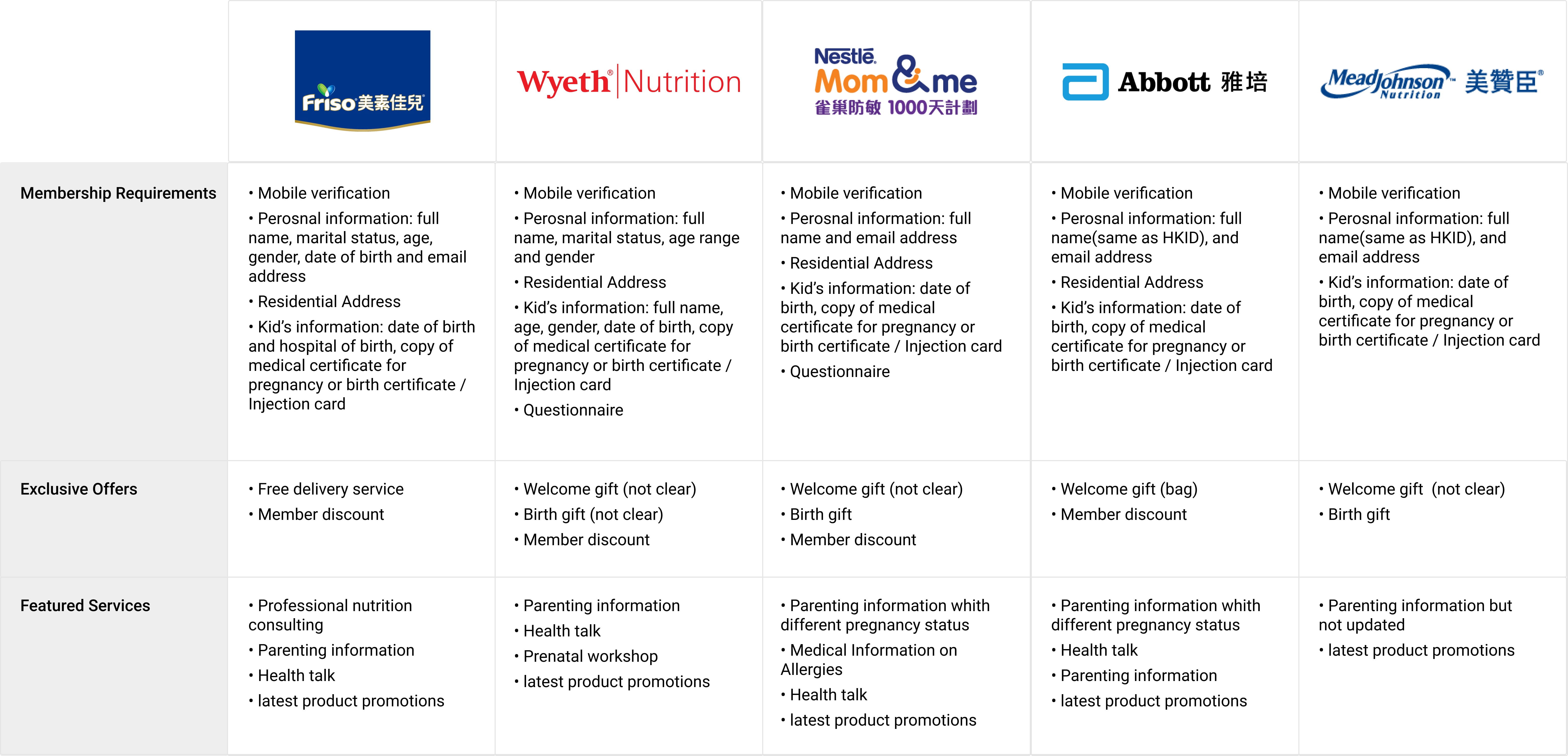
To gain inspiration for the mom membership website, I began by identifying 3 main competitors including Friso, Wyeth, and Nestle. Through comparing and identifying common contents, I found that club membership websites typically have lots of large member benefits including exclusive offers and featured services. They also have a large focus on membership requirements.
Capture the parent's goals, behaviors, and pains
Translating the user flows of 5 phases into high-fidelity wireframes for user testing and validations with stakeholders to make sure to improve the product usability especially error handling. To reduce the back and front effort with the team, I created annotations and rationales into the wireframes to communicate to clients and developers why the important interface elements are placed in a specific location and what the interaction model is for the element.
Discover the customer's actual experience
The primary needs and potential solutions I defined were:
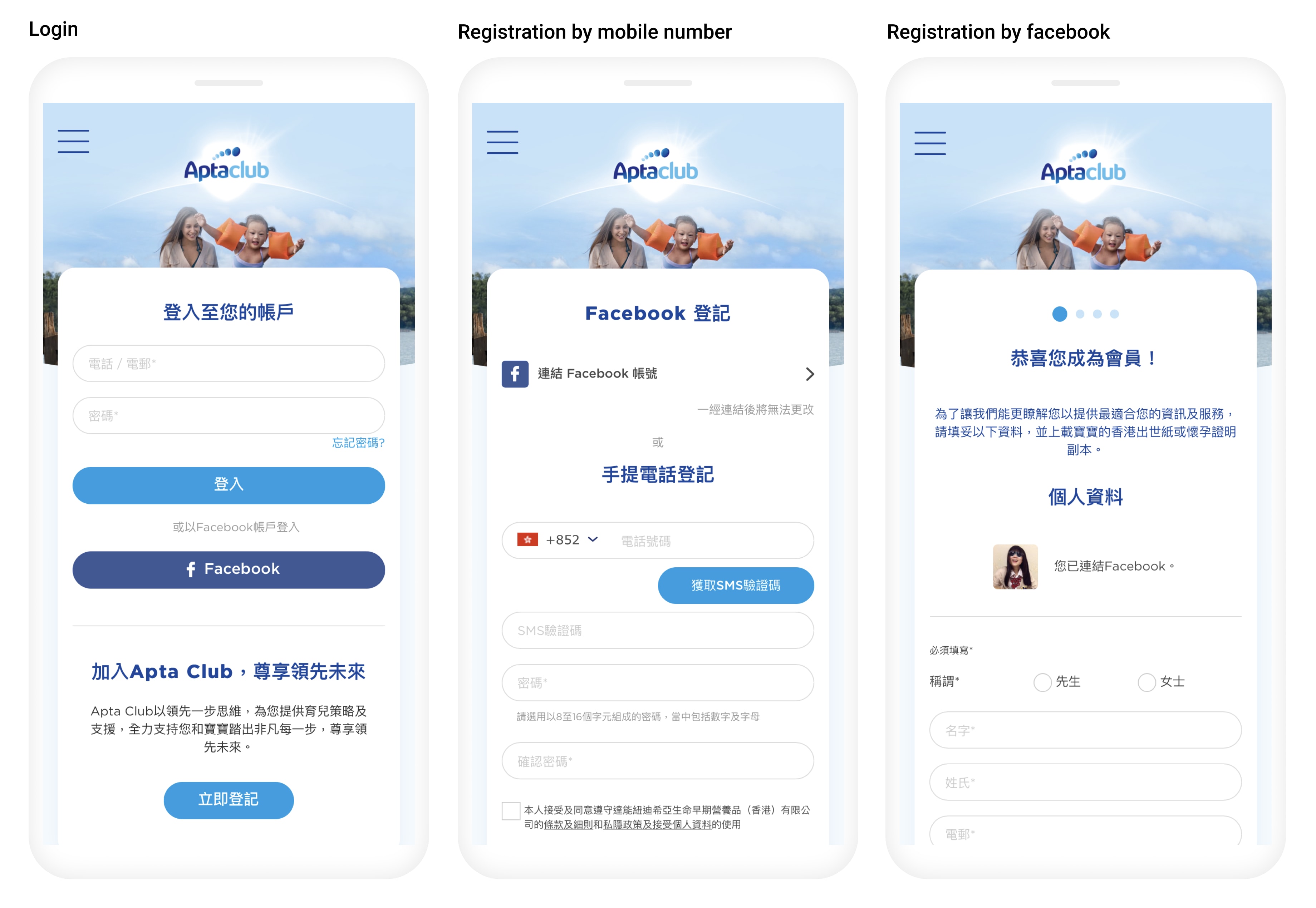
1. Clear guidline about registration: Progress bars (status of ongoing processes), short form, step by
step
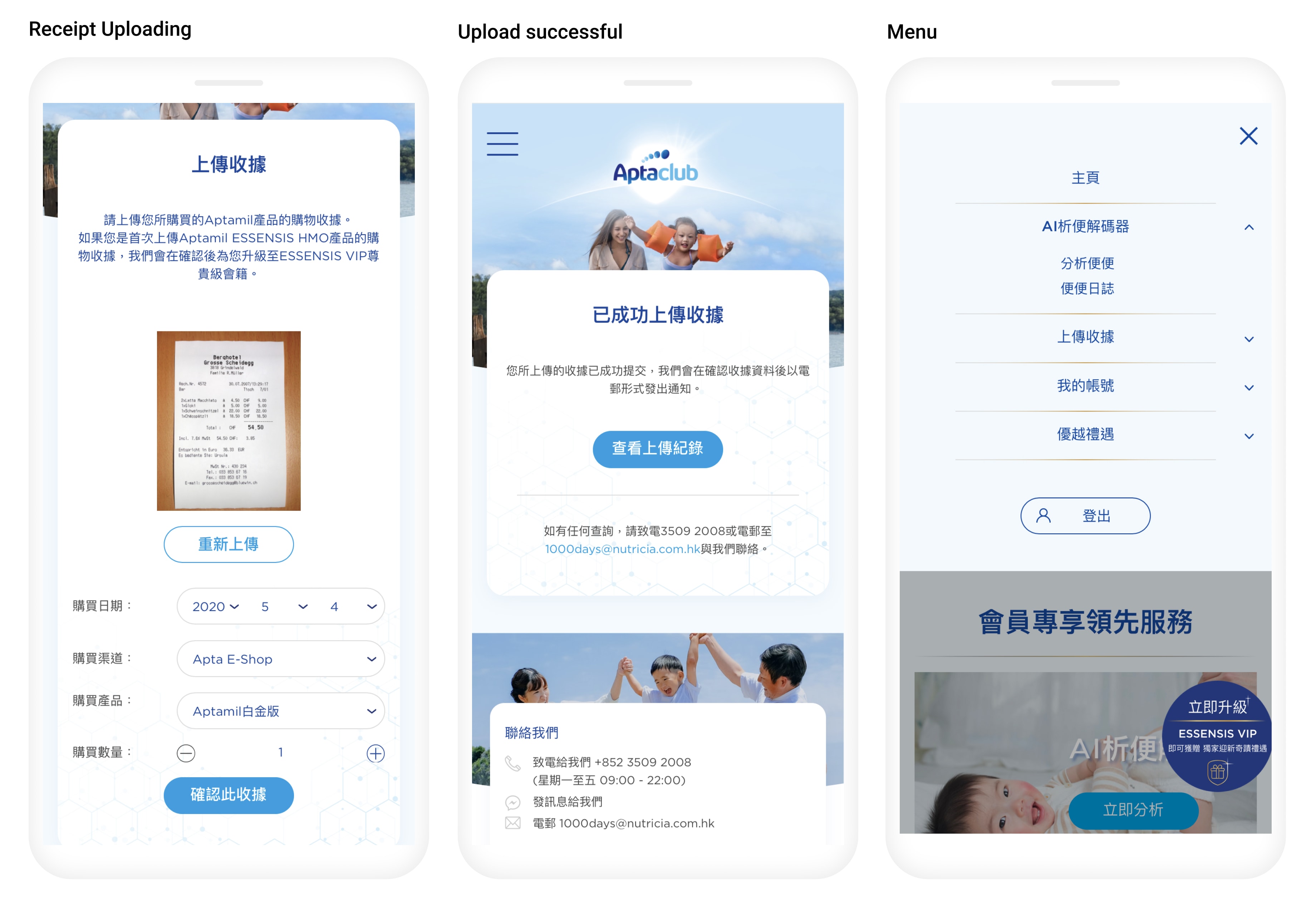
2. Efficient registration: Submit some information/certificate required after registration completion,
Alert dialog/Prompt dialog
remains to update account info
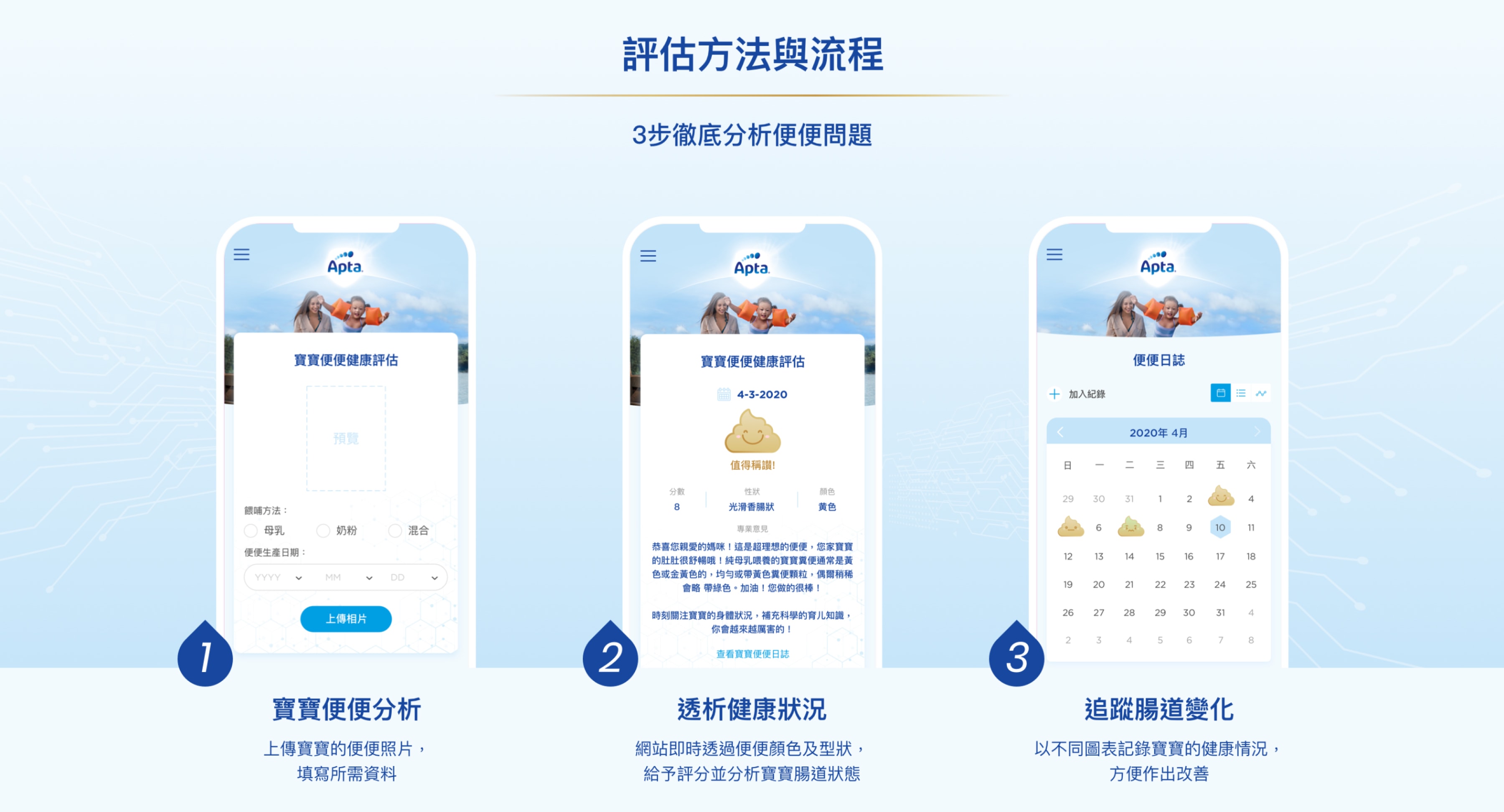
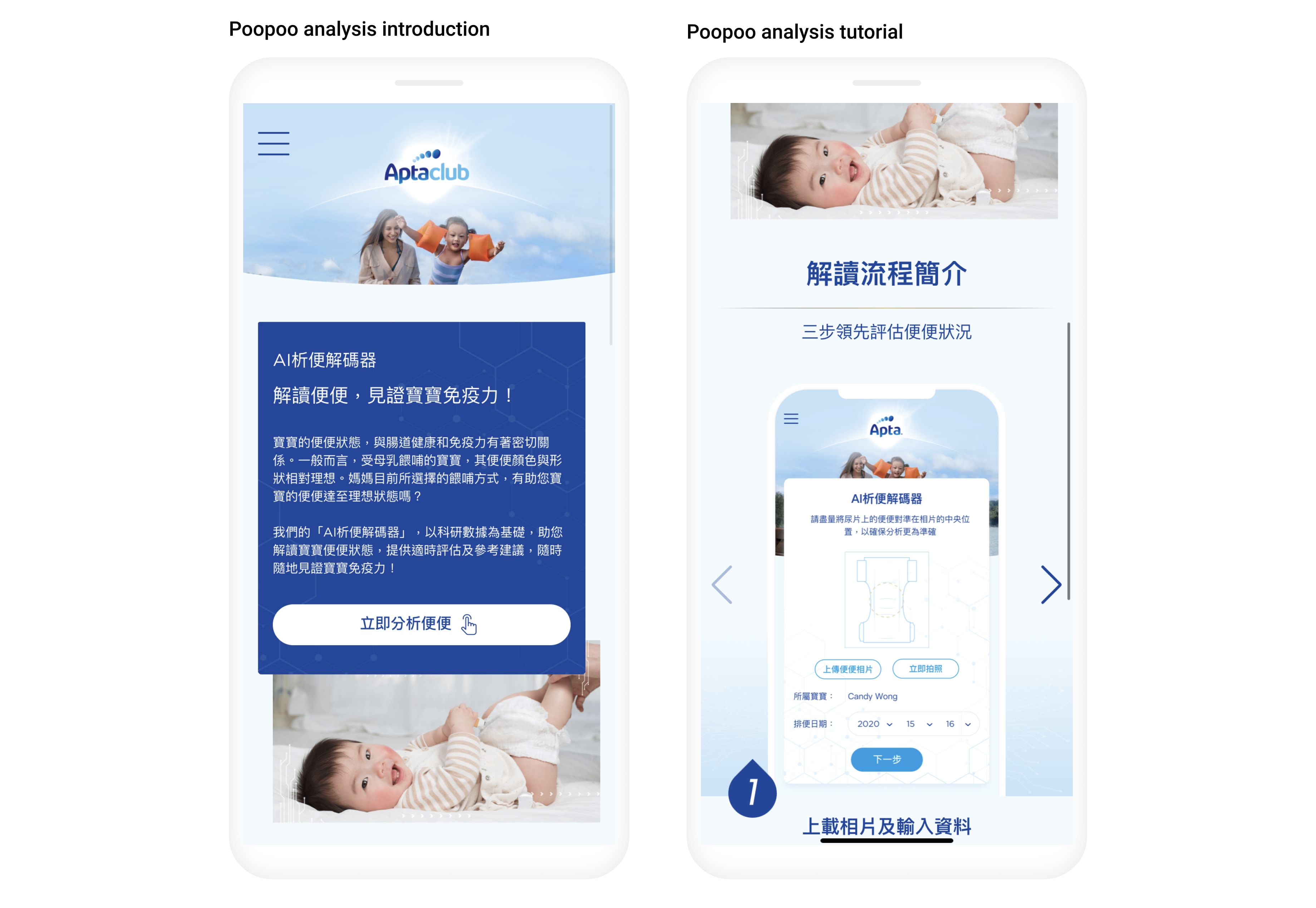
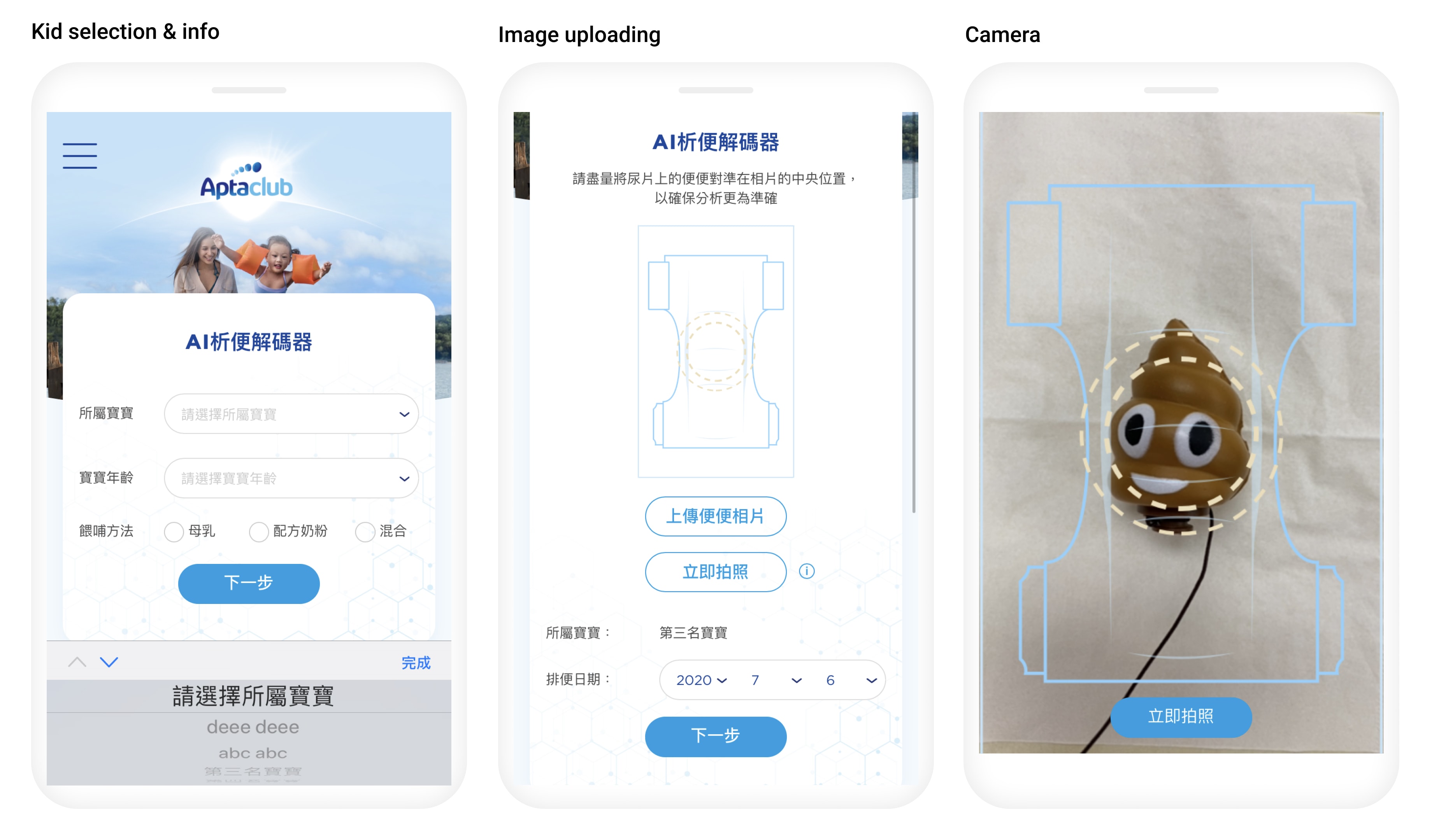
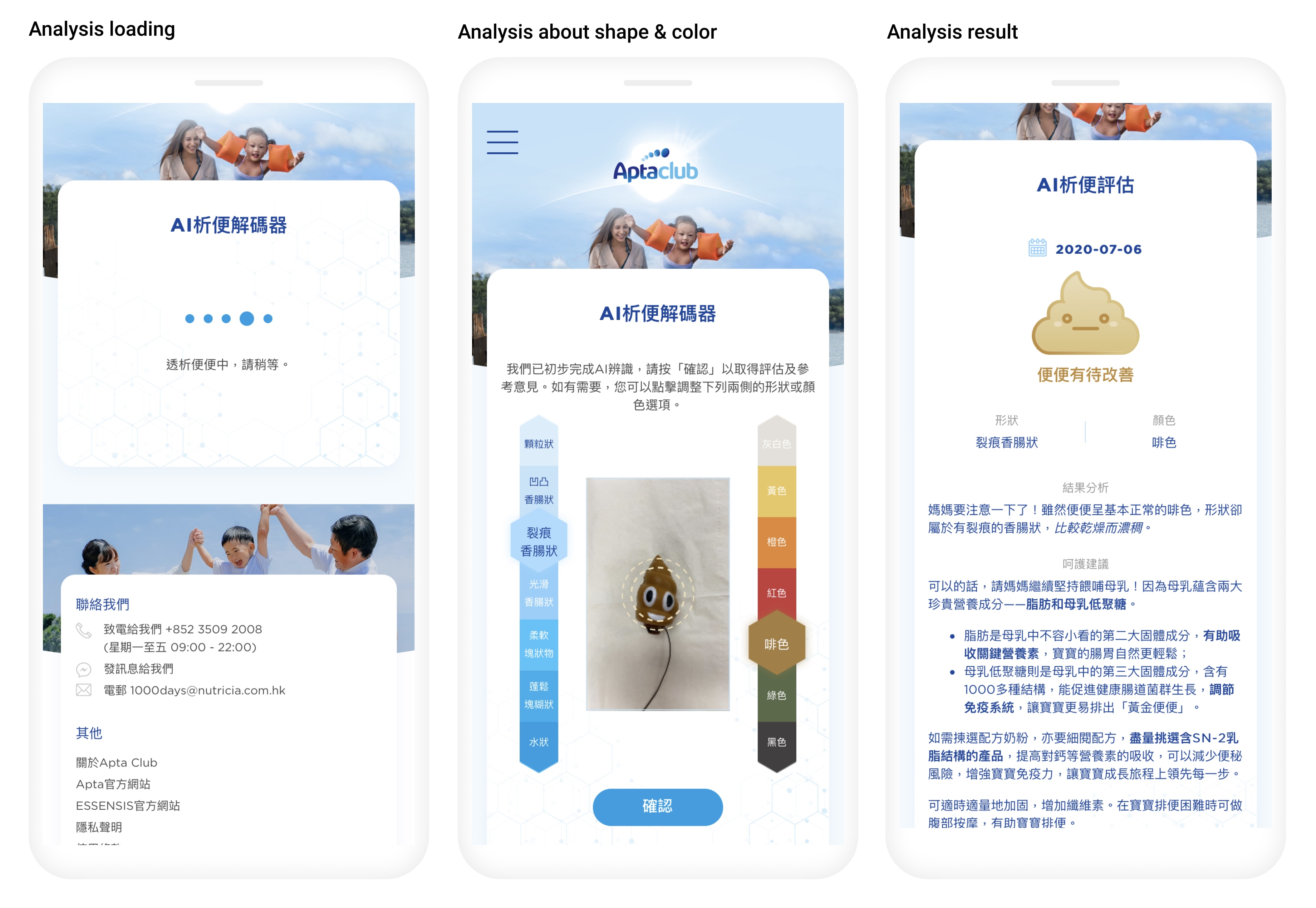
3. Clear introduction about Poop analysis: illustrate the details and process
4. Efficient anaylsis: Require to follow guidline, tips, tutorials
5. Result details: Score, emotion icon, percentage
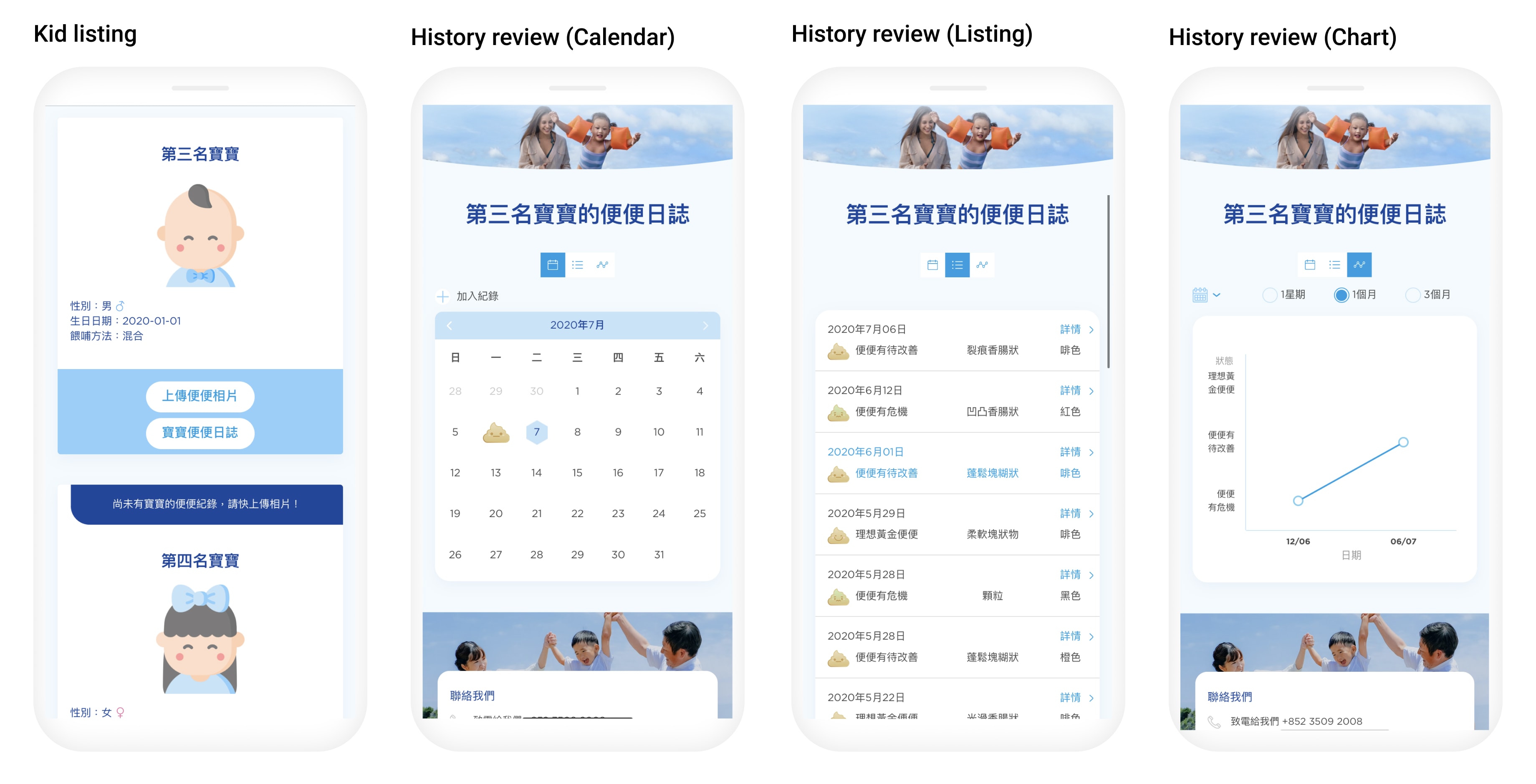
6. History reviews for health checking: Calendar to trace, chart analysis for overview
Make each user's goal more specific
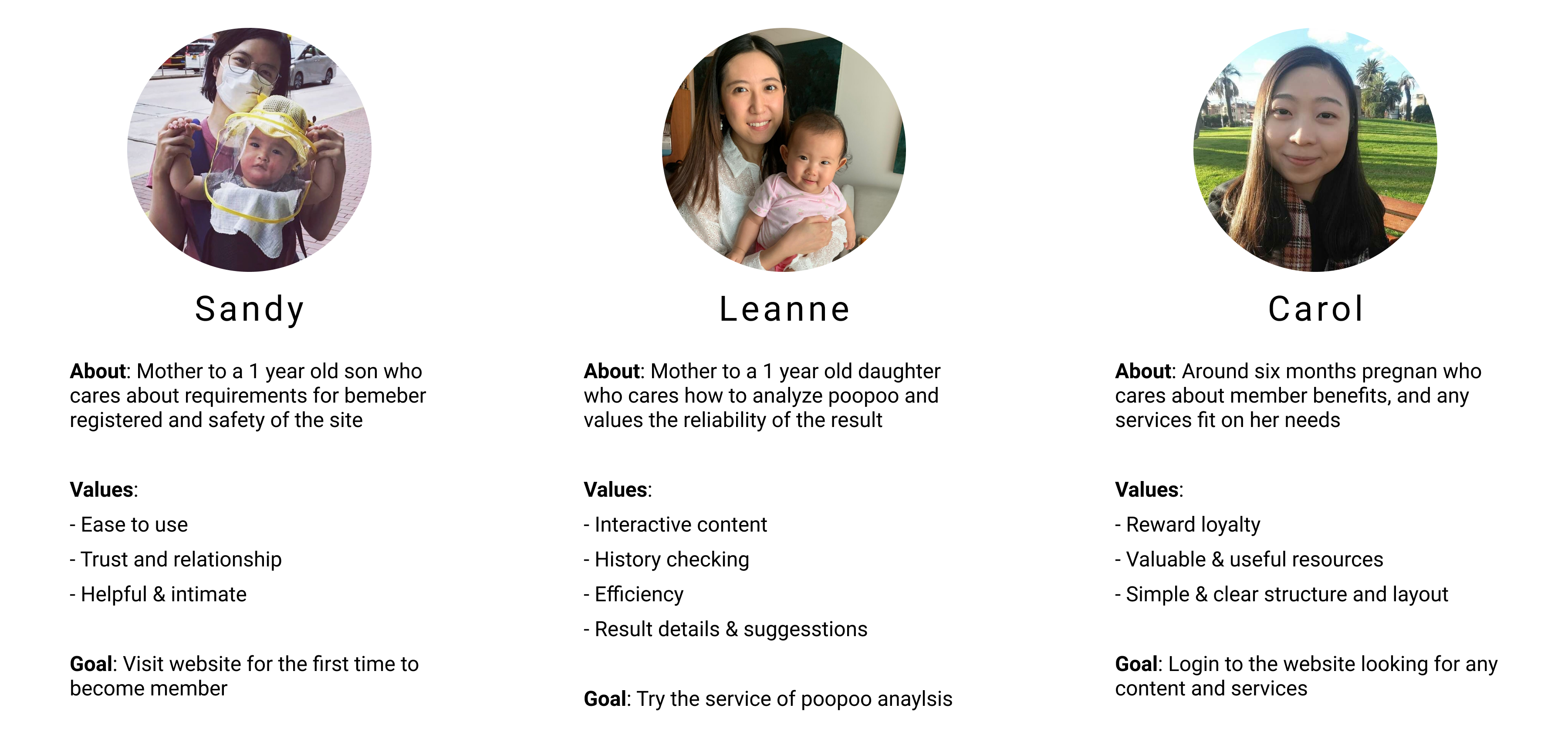
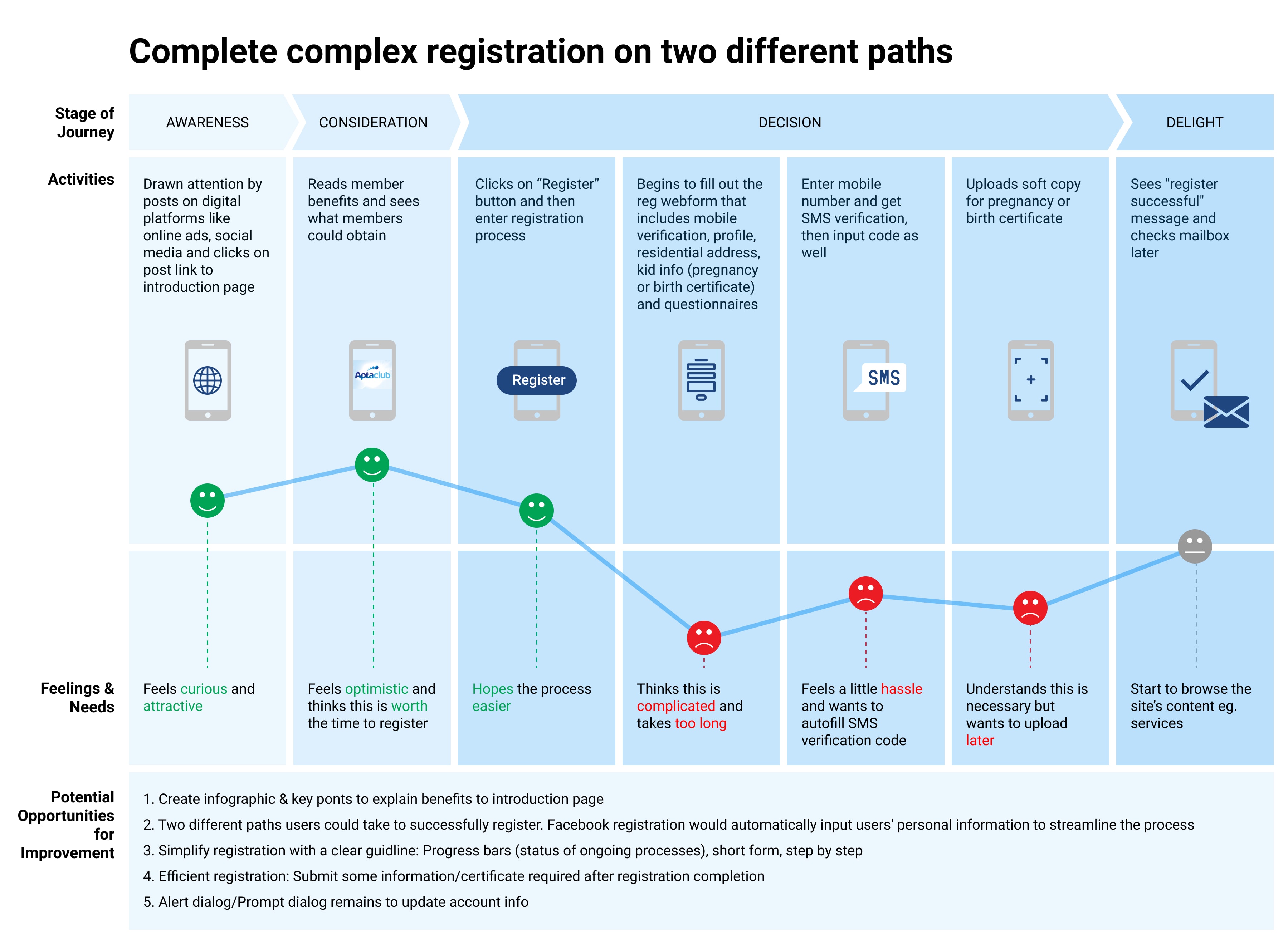
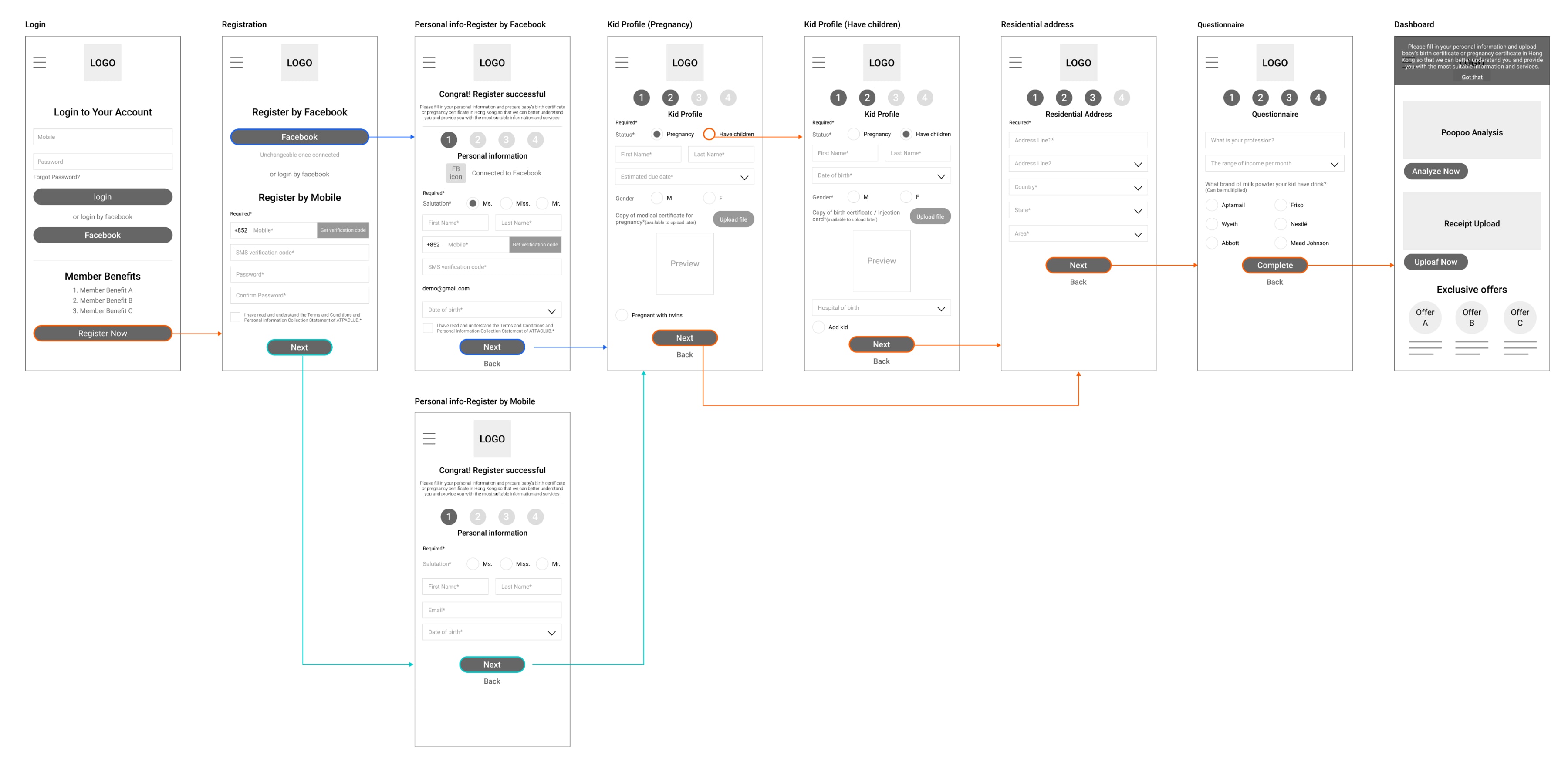
After defining the “bigger picture” of the experience I needed to provide the users, I created a user flow for each of the personas to make this experience more specific to each of their goals. The point of this was to define the intended steps each user might take through various pages and actions on the website in order to complete their goal. Not only would this allow me to focus on what each of the users needed to accomplish, but also how to deliver that experience in the most effective manner possible when designing my website. The first user persona I addressed in my user flows was Sandy.
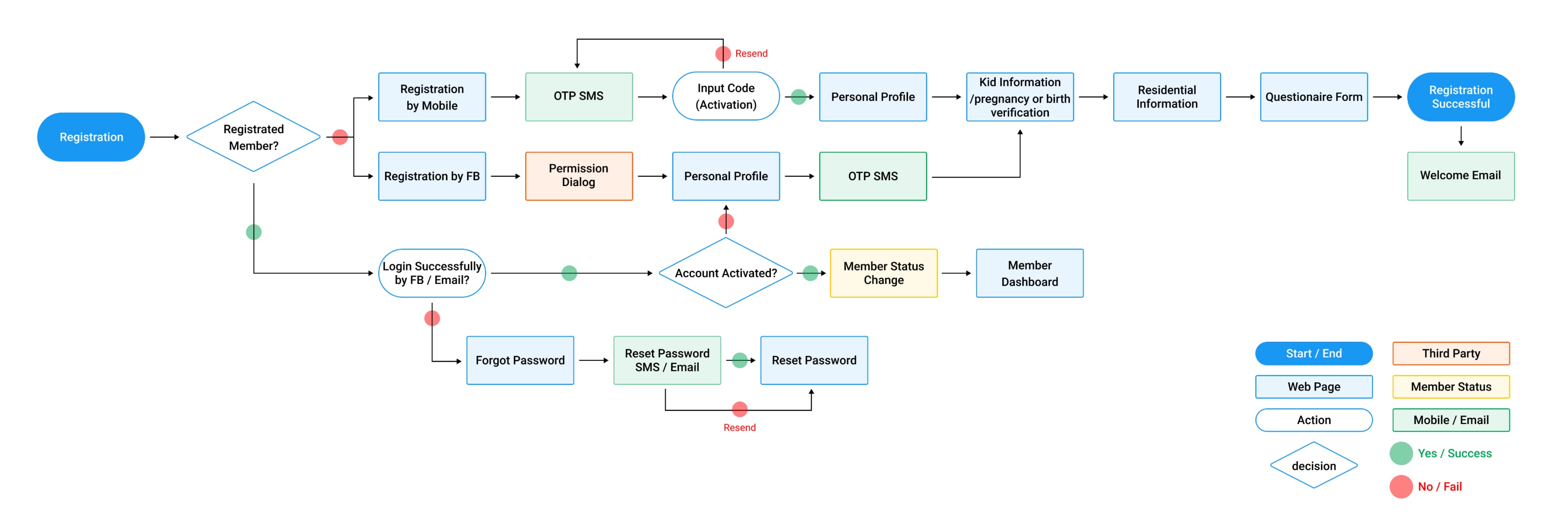
Sandy’s main goal was to complete complex registration. Her user flow shows the two different paths she could take to successfully register. Facebook registration would automatically input her personal information for her to streamline the process, I wanted to minimise the steps she needed to take to complete the complex registration.
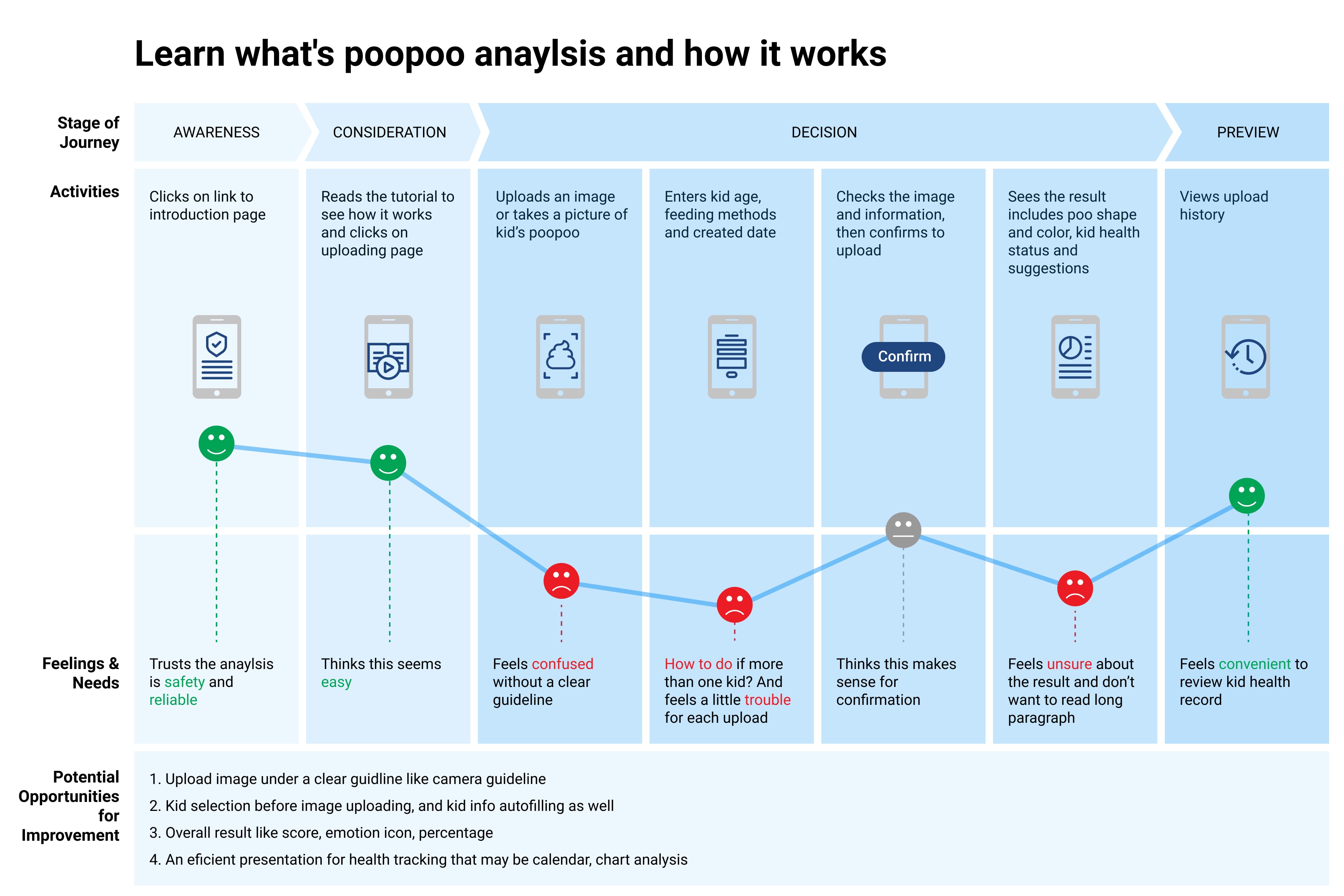
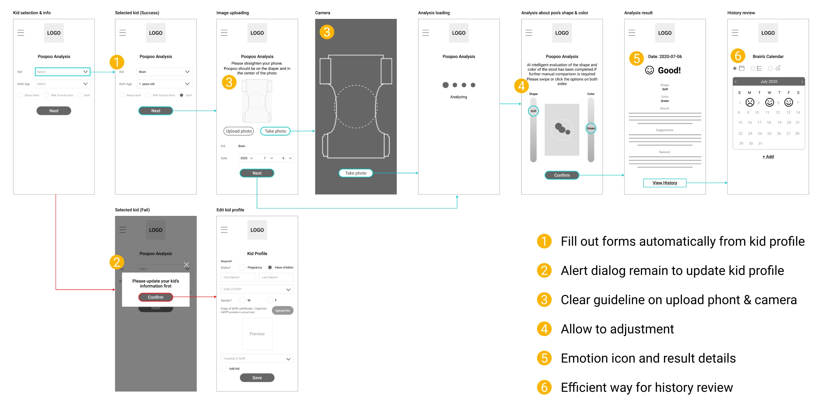
Both Leanne and Sandy wanted to know what's poopoo anaylsis and how it works, so it was important that I cover this in one of my user flows. The flow below shows how Leanne might accomplish her goal once she became a member.
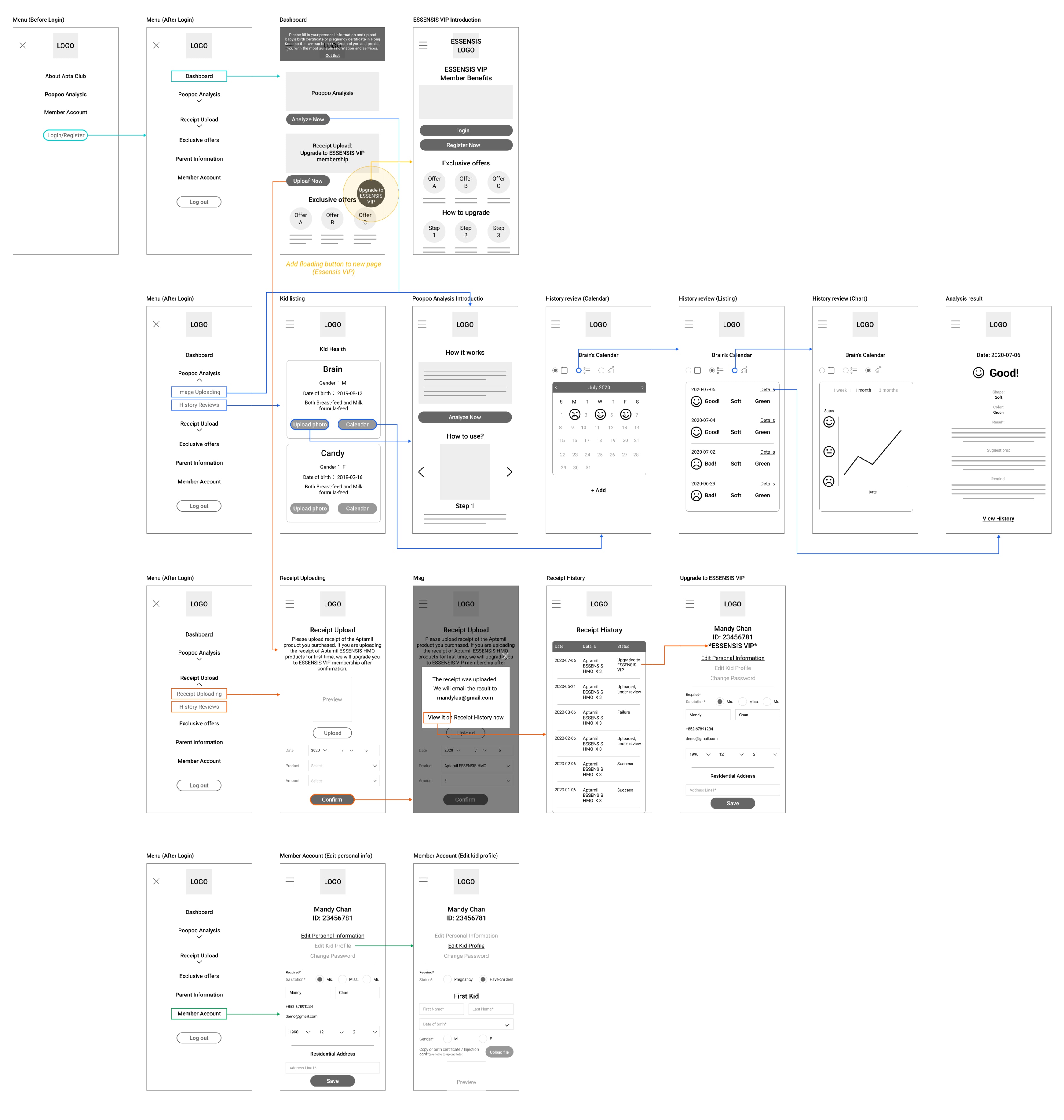
Carol wants to know any content such as services when she login to the member site. I need to ensure that all content is properly classified.
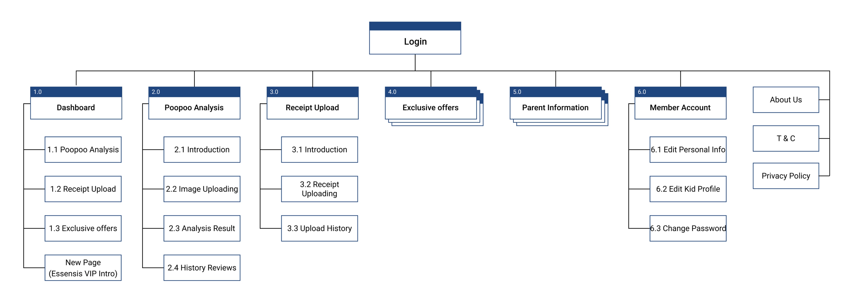
Organize key content and eliminate any unnecessary pages
With the results of the user interview and inspiration from other competitor websites, I created a site map to define the overall structure of the website. This was to ensure that poopoo analysis were going to be placed where users would expect to find them when logining the membersite and make the experience more intuitive.
Focus on the more functional aspect of the design
Once I organised all my insights from the exploration phase, I began to design the website. I designed several of the site’s main mobile screens, using my user flows as a guide. This allowed me to quickly explore several concepts for the website layout.
Test hypothesis with users
Once I completed my wireframes, I created a prototype of my website to begin usability testing. This would allow me to evaluate how users would engage with the proposed website solution and validate whether it was addressing the primary user needs. It was important to test with mid-fidelity, greyscale wireframes to gather honest, critical feedback from potential customers and to solidify the functionality of the website before addressing the visual design.
I conducted a usability test with 5 participants and asked them to complete three different
scenarios to put themselves into the
shoes of my user personas. These three scenarios included:
1. You need to upload Poopoo image of your kid for analysis, show me how you would upload and
successfully get the result
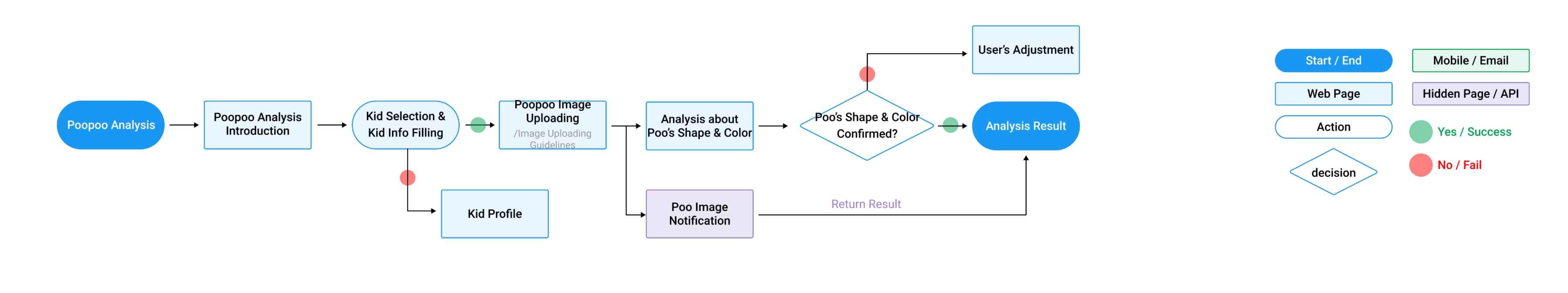
2. Show me how you would do if you are adoubt about the analysis
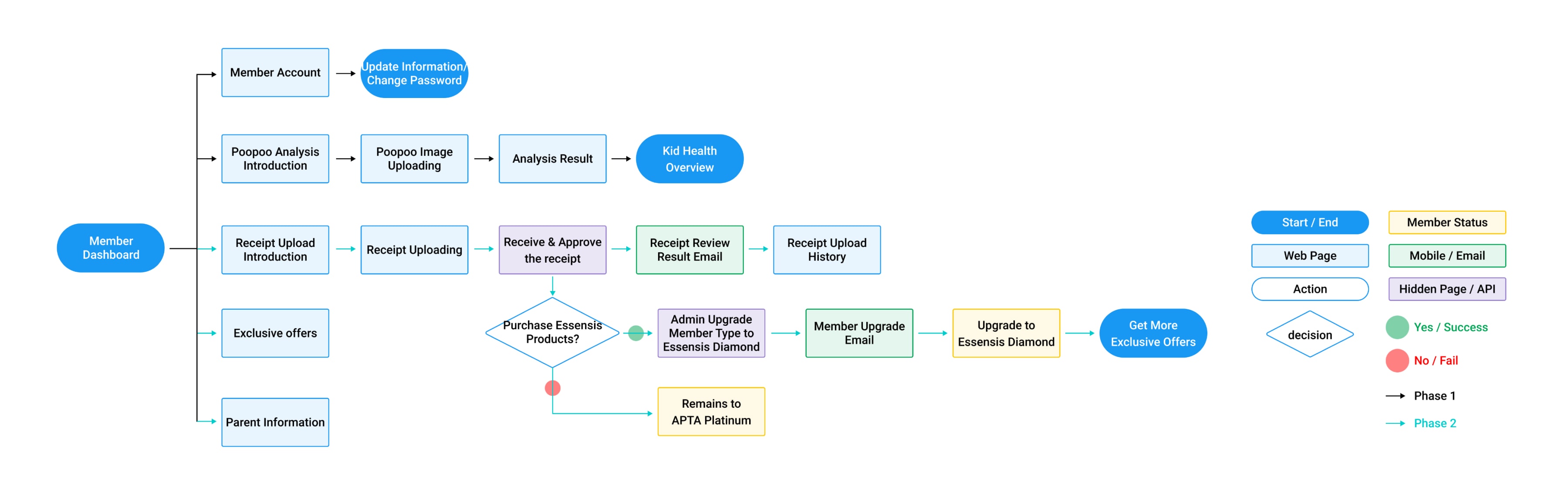
3. Show me how you would upgrade to Essensis VIP
These were my key findings from the tests:
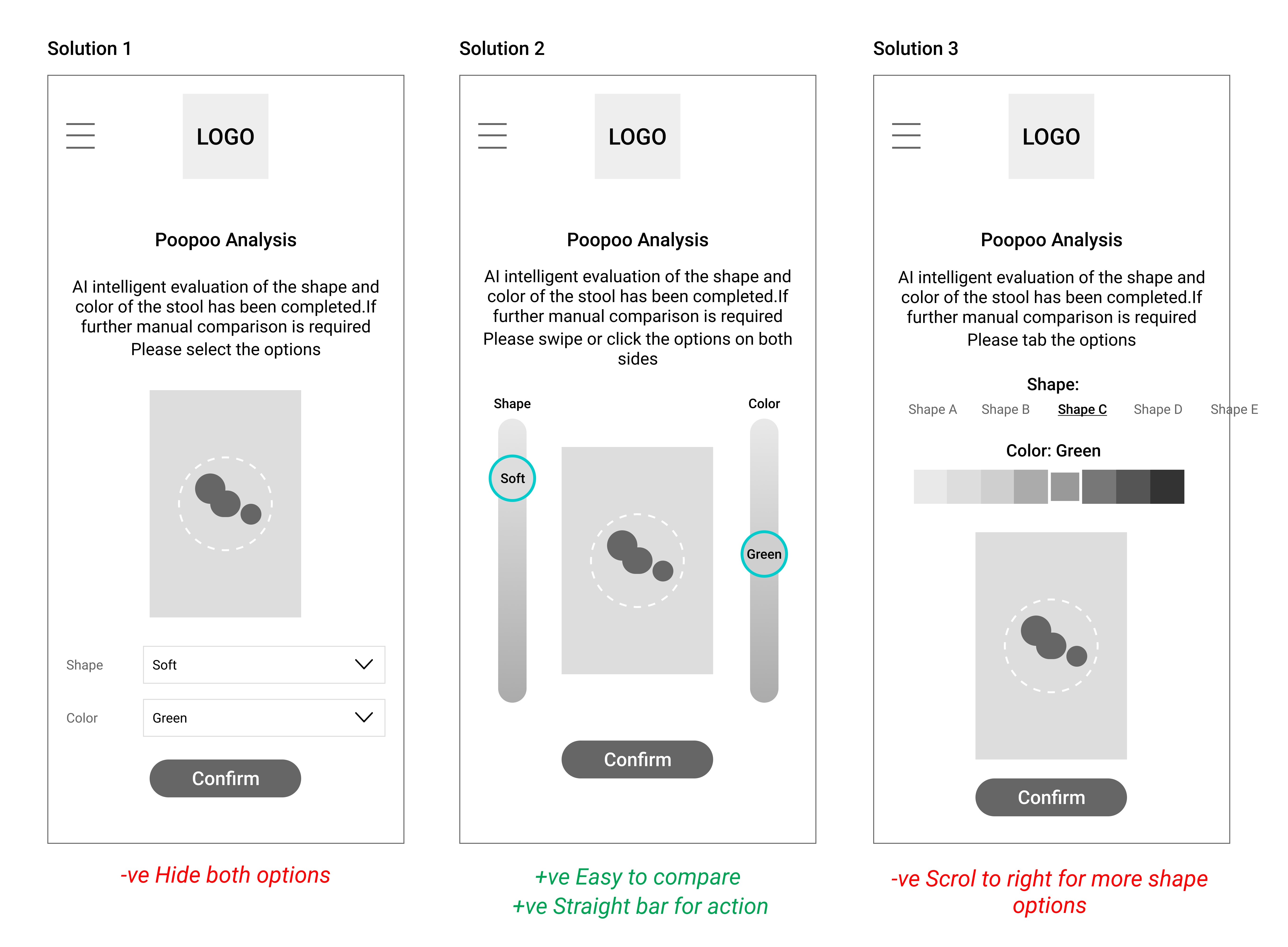
Overall users were able to easily login the website and locate site services.However, The majority
of participants wanted a way to adjust
shape,color if they didn’t want to click the drop down box.
Boost brand consistency with UI Design
I have also created content for the website and start to incorporate more of the visual style and branding of Aptamail. Below you can find my initial explorations into how this visual style might look. I wanted the visual design to emphasise these core values: simplicity, creativity, and consistency.

Takeaway: Keep learning, keep iterating
The Aptaclub has received both positive and negative feedback since its member site has been launched. Over 2,000 users became member and around 20% of them frequently use poo anaylsis tool . Users have responded well to the site's features and the simplistic design. Unfortunately, negative feedback largely relates to the accuracy of poo anaylsis tool—issues beyond our control and subject to ongoing improvements. More importantly, we keep learning and iterating around our goals.
